


The first iteration used rotated and flipped pieces of Jan van Eyck’s The Arnolfini Portrait as images. Thinking through how and why those images were used, how they function in the first iteration, I decided that a new “image” seemed appropriate, but one that would bring different complications into the construction. I settled on appropriating & distorting pieces of Frank Stella’s black painting, The Marriage of Reason and Squalor II, (1959). The reasons for this choice were multiple & shifting, and I don’t want to go into a specific, limiting description here. But the painting’s title is one of my all-time favorites, and in & of itself fits nicely with the NewLights Press aesthetic.

The digital mock-up of the pages with the Stella images looked like this:


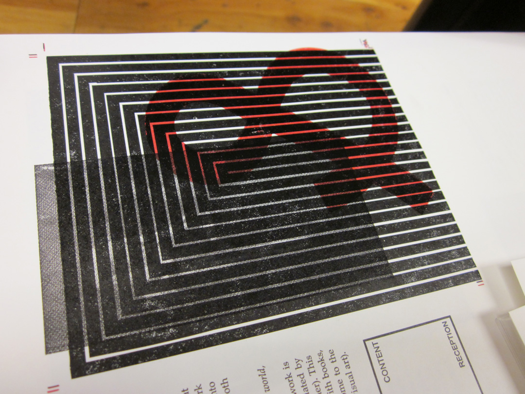
But always the questions: how to print them, should that printing be related to the van Eyck images of the first iteration, and if so, how? My initial idea was to print the Stella images straight from photopolymer, but to cut the films with rubylith by hand, without a straight edge, in order to make the edges less rigid as in the original painting. But that didn’t seem to be enough—simply relying on the title of the paintings and the reader’s knowledge to make the connection would be too tenuous & wouldn’t actualize the layering of the text/books. I decided that both images should be printed, the original van Eycks and the new Stella, right over top of the other. The van Eycks would be printed as halftone photographs directly from the photopolymer:


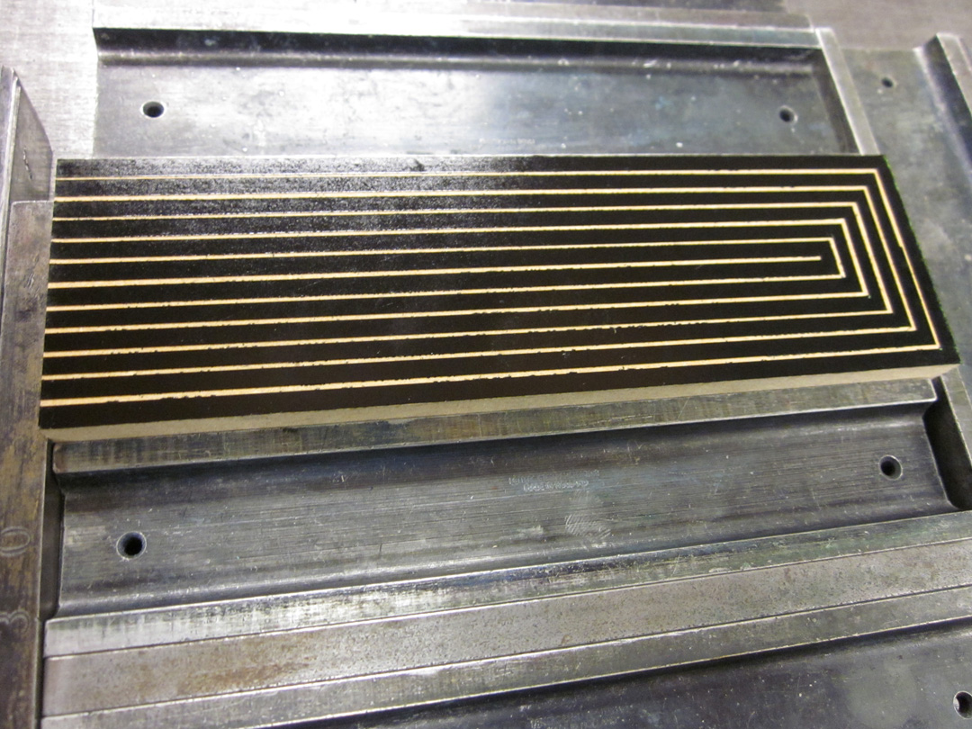
And the Stella images would be printed from hand-cut, vinyl collagraph blocks, which would give the stripes the edges that I wanted, but would also print with a different surface quality and thus bring the physical material of the printed pages more to the reader’s attention. Obviously, printing the images from collagraphs would mean more labor: making the blocks, and then printing them in separate runs/lock-ups. My hope was that the transformation of the printed surface, and the legibility/attention to the material that would bring, would make it worthwhile. But isn’t that always the hope with these things. Here are some images from the construction of the collagraph blocks:


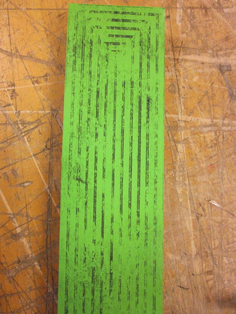


Most of the printing of the collagraphs went very smoothly, as expected from earlier tests. The cover block did not behave as planned—it fell apart while printing—but that was actually better & more on that in the next post.


The layering (printed in two slightly different blacks, one rubber-based, one oil-based) was subtle but effective. The images, with their heavy, messy, physical black are enjoyable to touch and look at closely. They are difficult to read, but still very legible.

Also, the second iteration of The New Manifesto of the NewLights Press will be officially released on this coming Monday, April 22, 2013.


No comments:
Post a Comment