skip to main |
skip to sidebar
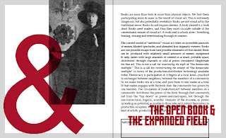
The Second Iteration of The New Manifesto of the NewLights Press is now officially out & available for purchase.
From the actual text:
[…] Now that the book is dead we can begin to divide up its remains. There is much work to be done. They used to say that the function of the book was to transmit information. Now they say that books are no longer the best way to do that, that computers and their strange, wireless spawn are the best way. They are right: a handheld device that can access any text from any place does a better job of delivering information. They are wrong: books and the writing-designing-printing-binding-distributing-reading of them have never been solely about delivering &or receiving information. They would also have you believe that you are, first and foremost, a consumer.

But the reader is both a consumer and a producer. The reader receives the text-book-art-object, and her reading takes it in, uses it up. At the same time she produces the text-book-art-object, putting its paths of meanings into play and driving them outward. The text-book-art-object is a unit of light, both particle & wave, energy transmitted, expended & still potential, waiting to be absorbed & re-produced in the reading. Energy creates energy. Production creates production. Production creates our shape in the world, is our shape-in-the-world in the movement-between of the world.

Our existence is a constant generating of text. We radiate text, reflect text, shed text like skin. We speak, we write. We send emails, text messages & memos. We fill in forms, we get a receipt with every purchase. Our world is bounded by, covered in, channeled through, text. The text-book-art-object is our sublime vision of the turbulent sea of language. It will be the death of us. It is our light-filled life.
We are only beginning to see. Let the book-in-the-world sit strangely in your consciousness, let it dissolve and disperse everything that they said you are. In this world you will be disciplined or you will be destroyed. But you have the choice: be disciplined by the tasks of what you produce, or by the tasks of the things that are being sold to you.
What has already begun is the New Manifesto of the NewLights Press. It is a collection of thoughts on and of the book, of what it can mean to make books, to produce the book, now. […]
The New Manifesto of the NewLights Press (second iteration)
20 pages, saddle-stapled
6.5” x 5.5” (closed)
Letterpress printed from photopolymer plates and collagraph
Unlimited, iterative edition
2013
$5 (plus shipping)
UPDATE ON 2/13/15: The second iteration of the New Manifesto is now OUT OF PRINT. The third iteration is forthcoming in 2015.

As is not uncommon for NewLights books, the cover was the last part of the second iteration of The New Manifesto of the NewLights Press to be printed. The cover is almost always the last thing designed as well, and I always have to be careful not to rush through it. I’m always so much more interested in the interior (that’s where most of the work, where most of the book, is after all) and always in a hurry to get to production by the time the interior is designed. But the cover is important—it sets the stage for the reader’s initial interaction with the book.
The cover to the second iteration is set up similarly to the pages. The title uses the modular titling type (this time printed as negative space, off-white paper/letterforms against a bright medium-blue block) and a palimpsested-pentimento image printed by layering a hand-cut, vinyl collagraph over a halftone image printed from photopolymer. And, silly me, I expected the printing to actually go like the printing of the pages—simply, smoothly. Fortunately, when it came time to print the collagraphs, it didn’t work out that way.
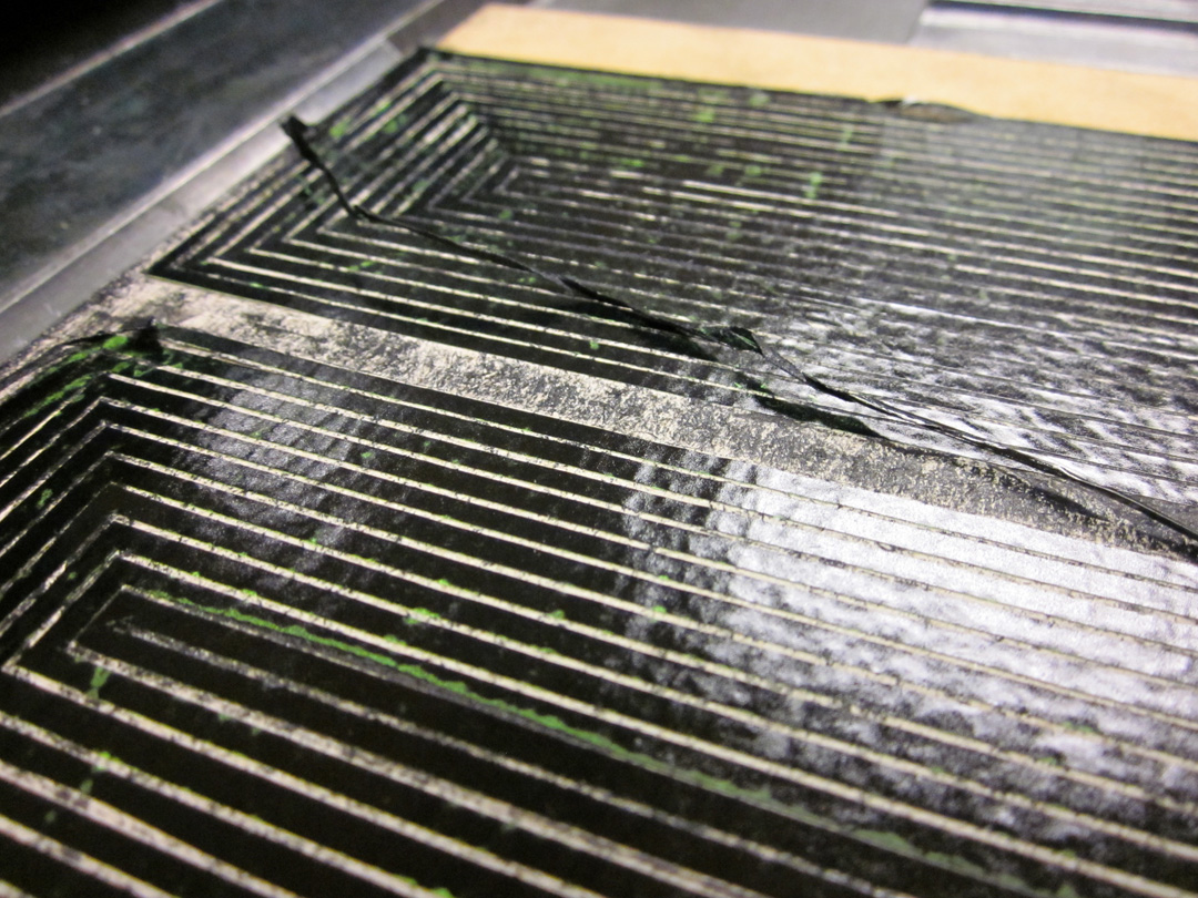
There were, actually, some minor incidents when printing the collagraphs in the pages. I was using two kinds of blocks. One type had the adhesive vinyl applied directly to the MDF block. Those all held up beautifully. The second type, where I needed large open negative spaces and thus much higher relief on the block, used vinyl over thick chipboard, which was then attached to the MDF base. The problem with the chipboard is that it tends to come apart while printing—the layers just peel away. (One way to prevent the separation is to seal the sides of the chipboard with some kind of adhesive—I neglected to do that on these blocks.) I managed to keep the separation of the chipboard under control on the page blocks—the design of those blocks, with large, flat areas made it possible. The cover collagraph, however, had the small, repeating Stella stripes—the densest pattern in the book as a whole. It was a pain to make.
& it started to peel apart after about 6 or 7 impressions.

Initially, I fought it, tried to save it. (I was, also, of course, right up against the absolute deadline to get the covers printed & the books done for an exhibition.) It quickly became clear that it was a losing battle—as soon as one stripe was secured, another broke away.
One of the really interesting things about collagraphs is that, generally, they are made from objects-in-the-world, real things with both 2D & 3D qualities, and all of those qualities carry through into the print. Printed collagraphs become a record of a 3D object. (All printing from a physical matrix is a similar record, but most matrices are constructed to minimize their “interference” in the printed image.)


That 3D record was exactly what I saw in the prints from the degrading block. The piece of detached vinyl had moved & crumpled—it was literally printed on top of the rest of the image, and held all of its 3D properties. In the print, it looked as if the stripes in the Stella “image” were coming loose and hanging from the surface (which they were). The print oscillated between the intended, 2D articulation of the cover surface/picture plane by the stripes that were well-behaved, and the unintended, anarchic pictoriality of the peeling stripes. It was, for this book, better than I could have planned. AND because the vinyl stripes were detached, they would move with every pass of the press and print differently every time—the record would be 4 dimensional as well, spread over the edition. The only question was: would the block hold up enough, as in not peel completely away, for the entire press run?
The loose vinyl stripes were remarkably resilient (aided by a single piece of painter’s tape applied at the base of the block). They eventually would break & get stuck in the rollers:

but overall, the block both broke apart & held up beautifully for the entire run of 250+ impressions. & I was so much happier with these new, crazy, variable, unplanned covers.
& then the next day I destroyed exactly half of those covers by carelessly cutting with the guillotine.
So now I will try to reprint that second half, and hopefully the new collagraph block will fall apart just as effectively as the first….
The other big question that emerged during the construction of the second iteration of The New Manifesto of the NewLights Press (other than the minor details of text-content, the overall design, and the titling type) was how to handle the visual elements. I wouldn’t really call them images. The non-text text, perhaps. The writing-design of the book was a kind of palimpsest of the first iteration—using the same size, shape, and the same basic visual/formal structure, the idea being that this second iteration would exist as a kind of layer over the first iteration. Not an obliteration, but more of a pentimento. The book should always show its scars.


The first iteration used rotated and flipped pieces of Jan van Eyck’s The Arnolfini Portrait as images. Thinking through how and why those images were used, how they function in the first iteration, I decided that a new “image” seemed appropriate, but one that would bring different complications into the construction. I settled on appropriating & distorting pieces of Frank Stella’s black painting, The Marriage of Reason and Squalor II, (1959). The reasons for this choice were multiple & shifting, and I don’t want to go into a specific, limiting description here. But the painting’s title is one of my all-time favorites, and in & of itself fits nicely with the NewLights Press aesthetic.
Frank Stella, The Marriage of Reason and Squalor II, enamel on canvas, 1959
The digital mock-up of the pages with the Stella images looked like this:
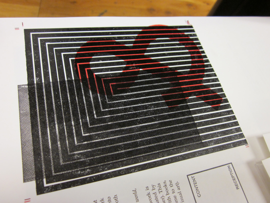
But always the questions: how to print them, should that printing be related to the van Eyck images of the first iteration, and if so, how? My initial idea was to print the Stella images straight from photopolymer, but to cut the films with rubylith by hand, without a straight edge, in order to make the edges less rigid as in the original painting. But that didn’t seem to be enough—simply relying on the title of the paintings and the reader’s knowledge to make the connection would be too tenuous & wouldn’t actualize the layering of the text/books. I decided that both images should be printed, the original van Eycks and the new Stella, right over top of the other. The van Eycks would be printed as halftone photographs directly from the photopolymer:


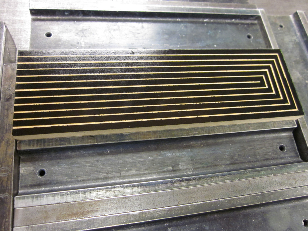
And the Stella images would be printed from hand-cut, vinyl collagraph blocks, which would give the stripes the edges that I wanted, but would also print with a different surface quality and thus bring the physical material of the printed pages more to the reader’s attention. Obviously, printing the images from collagraphs would mean more labor: making the blocks, and then printing them in separate runs/lock-ups. My hope was that the transformation of the printed surface, and the legibility/attention to the material that would bring, would make it worthwhile. But isn’t that always the hope with these things. Here are some images from the construction of the collagraph blocks:
Most of the printing of the collagraphs went very smoothly, as expected from earlier tests. The cover block did not behave as planned—it fell apart while printing—but that was actually better & more on that in the next post.
The layering (printed in two slightly different blacks, one rubber-based, one oil-based) was subtle but effective. The images, with their heavy, messy, physical black are enjoyable to touch and look at closely. They are difficult to read, but still very legible.
Also, the second iteration of The New Manifesto of the NewLights Press will be officially released on this coming Monday, April 22, 2013.
It was so much fun to make the modular titling type for The Heads that I wanted to do it again for the second iteration of the New Manifesto. In the first iteration I used the face Placard Condensed for the titles, which has been a longtime favorite of mine, even before I realized that it is essentially, at least in the capital letters, supposed to look like the lovely, generic, “Gothic” wood type that is common in letterpress studios. The thing that I don’t like about that typeface is that it often looks too condensed for my purposes. This is a major typographic confession—I’ve often used it and widened the glyphs 20% – 30%. As far as I know no one has ever noticed, but after I started looking carefully this time around, it became awkwardly obvious. So it was time for some new titling type.


Why modular type? The main answer, for me, is constraint & how that drives formal & structural decisions. I am drawn to the aesthetics of modular type, and it fits nicely with the formal qualities & structure of books—books (often) have rectangular pages, and they are at their core modular constructions—page after page after page designed on grid over grid over grid.
The complication (or perhaps luxury) that I gave myself this time around was the inclusion of a second modular unit—a triangle that is one half of the base square. I knew that I was going to print these letters from photopolymer plates, so why not, you know, get crazy?
I played with shapes & contours of the individual letters themselves for a while, trying out different shapes and refining. I needed numbers for this book, and that complicated things a bit, as the shapes of “S,” “Z,” “2” and “5” are very similar once curves & angles are eliminated. I could have used the same shape several times and relied on context to make the glyph, but I wasn’t sure that context would be enough in the case of the titles.
As the shapes of the letters developed I realized that there was something else to consider—proportion. While I was trying for letters that weren’t as narrow as Placard Condensed, I still needed them to be somewhat condensed so that they would fill the marginal space of the page. The width of the individual glyphs is one thing, but how narrow they are depends on the relationship of width to height. (This is all basic stuff, I know, but I am a beginner when it comes to type design, and these small realizations are an important part of learning.)


After I settled on the proper proportions for the letters, I was able to refine the contours within those proportions and determine the final letterforms. One challenge with modular type (at least in how I’m approaching it at this point) is its monotony & rigidity. It often looks forced into the flexible space of the book, particularly when paired with a great text type—like Palatino Linotype, which is what I was using for the main text of the book. The last tweak I made to the modular face was to change its base unit from a square to a vertically-oriented rectangle that was half of that square. The original square was still used for most of the letters, but that rectangle allowed for some small subtle differences that gave the letters more character and made some of them appear less awkward. The “F” and “G” are two examples.


Using the rectangle of the base unit also gave me more flexibility when typesetting and spacing the letters, allowing me to stay within the modular system when spacing but giving me enough options to balance the spaces out better.
The above images show the actual setting of the titles. I did not make these letters into an actual, usable font—I just drew them as vector objects within InDesign and cut & pasted them into place. Once they were set I could just copy them into the actual book document and scale them appropriately. Even during typesetting I still played with the letterforms a bit—it’s just so hard to resist the impulse to keep refining the letters. But there was a deadline & I had to get to printing. So here are some images of the type printed from the photopolymer plates: