skip to main |
skip to sidebar


Because the new New Manifesto is being written:
The NewLights Press is an independent printer & publisher of experimental writing and artists’ books, concentrating on where the two can and do overlap. All of the books are printed & bound “by hand,” using a variety of techniques, ranging from the obsolete (letterpress) to the utilitarian (laser printing). We try to maintain inclusive (& purposefully problematic) definitions of such mutable terms as “experimental writing,” “artists’ books,” and “printing techniques,” and to be similarly inclusive in the kinds of books that we produce, in an attempt to allow the different kinds of production to merge, separate, and converse with one another. We believe in the actual use value of art objects as soft, temporary spaces in and against which individuals & communities can envision & articulate their relationship to, and shape in, the world. We are not searching for the Ideal Book—we are looking hard at, & reading deeply of, the Book-in-the-World. We represent only one of the many geographical/historical meeting points of a vital and diverse community of active, thoughtful people, and our work would mean nothing without that community. The production of books is our own way of telling the rest of the world that we believe in them.
It is hard to be aware of how little one pays attention to something. Big things are moving in Art & Life these days, and the mornings, usually reserved for writing blog posts, have been filled with the meditative work of cutting and peeling paper. So there’s that. But today some time to write a bit about the nighttime activities—the continued adventures in the printing of The Heads (of My Family, My Friends, My Colleagues) by Justin Sirois.

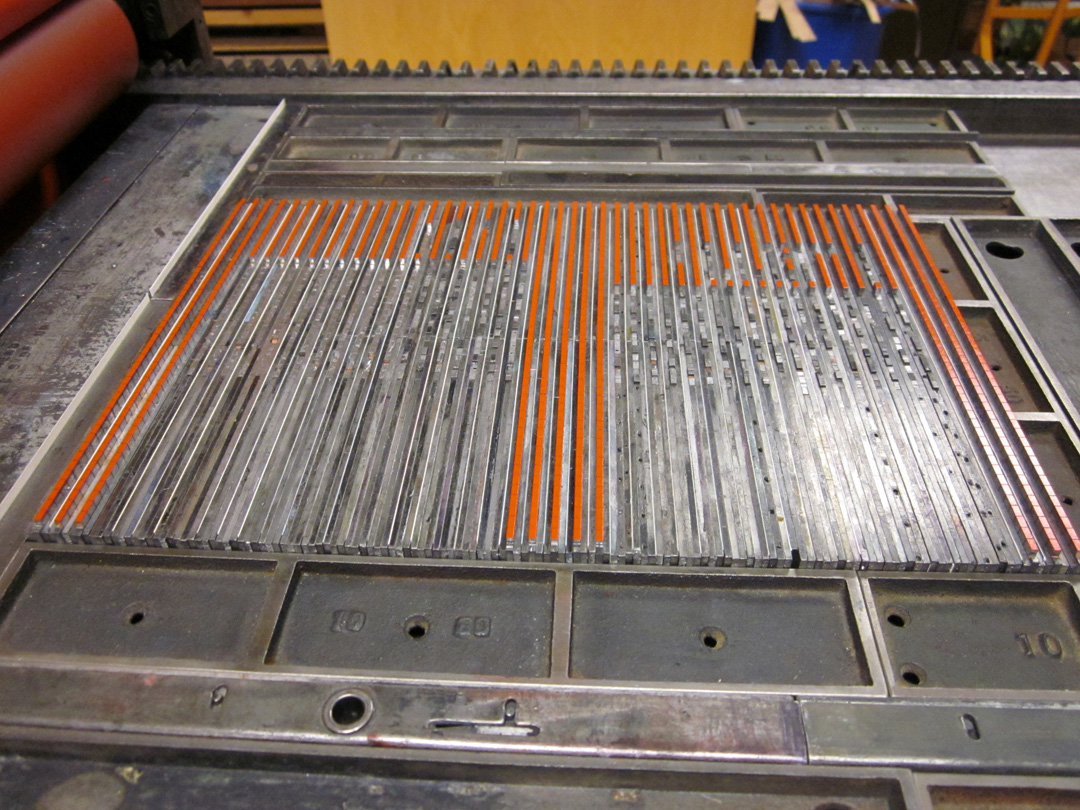
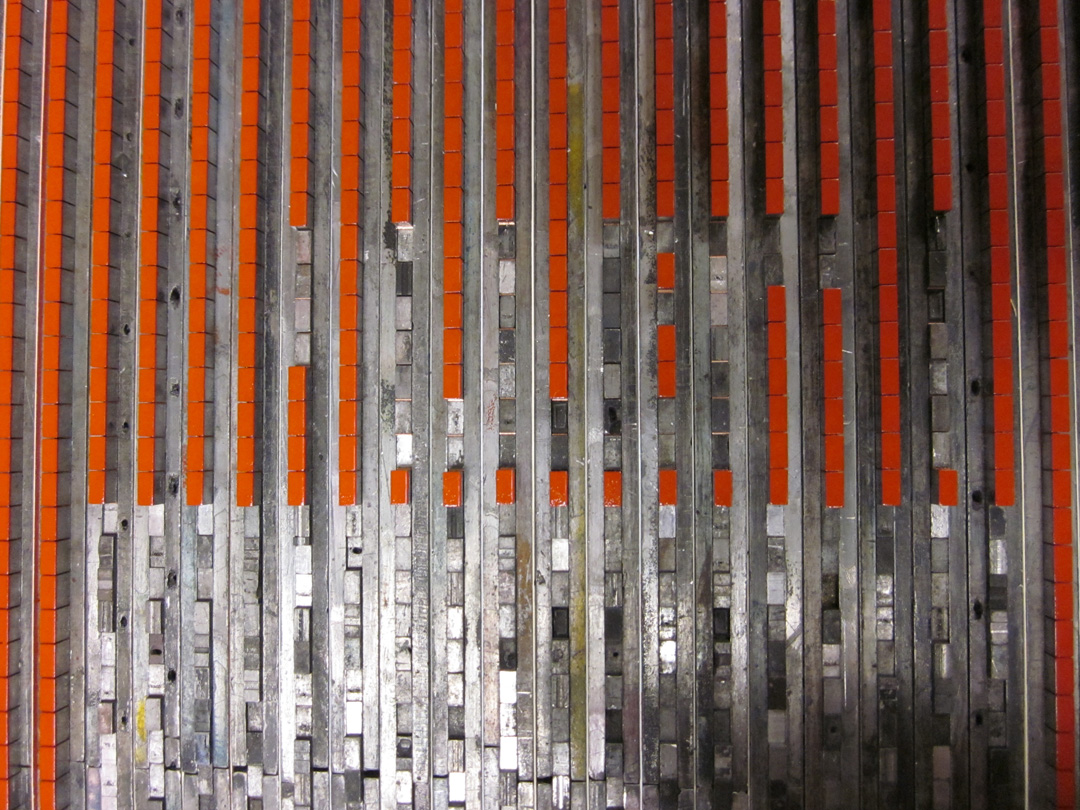
In earlier blog posts and on the NewLights Facebook page, there are some cryptic photos and descriptions of the “pixel grid” of The Heads. So I thought I’d explain a bit about what that actually is, how it works. These images are a bit old now—production has advanced to some later stages/colors. But more on that soon.
In the designs of other NewLights books where I was printing from photopolymer plates I tried to make that decision to use the plates count—to use the plates to print a book that only could have been made with them. For The Heads I wanted to try something different: to use a combination of good ol’ laser printing with letterpress, and to see where that led the book. This helps keep material costs down (those plates & films are expensive) and is appropriate for the content of the poems, which talk about life and images on, off and between our screens.
So the pixel grid. It is made from lead type, specifically from spacing material for lead type. With the assistance of the nice people at the M & H Type Foundry I was able to get 10 lbs. of 12 pt. en quads in “high spaces”—spaces that are a bit higher than regular word spaces. (I believe that these spaces would normally be used to support the kern of letters at the end of a word, say the “f” in “of,” but I’m actually not sure about that.) So with the high spaces I can still use regular spaces as spaces, and regular leading to hold the lines. And that negative space is important—it is what makes the grid do its work.


So the columns of the gird are assembled in lines, with copper spaces between each piece vertically, and 6 pt. slugs and paper leading (equal to 1 pt. in thickness) between them. The gaps in the columns will form the letters of the poem titles (the titles are all all-cap “acronyms” like TFIEG), made from the modular alphabet described in earlier posts. The grid itself, when complete, will contain groups of three columns in different colors—made to emulate the RGB grid of the screen. So the spacing matrix is assembled to print all of the red columns on a single page spread, and then it can be broken apart/reconfigured to print all of the green columns by just moving it 6.5 pts over in the press bed. And then the blue after that. I am doing all of a single color first, so there is a great deal of reconfiguring before the press runs containing titles. The lines of spacing are extremely prone to falling over at the ends, so it has taken me some time to get into the haptic rhythms of working with them effectively. But now things are moving. The text, the grids, the book, accumulate.