
20121220
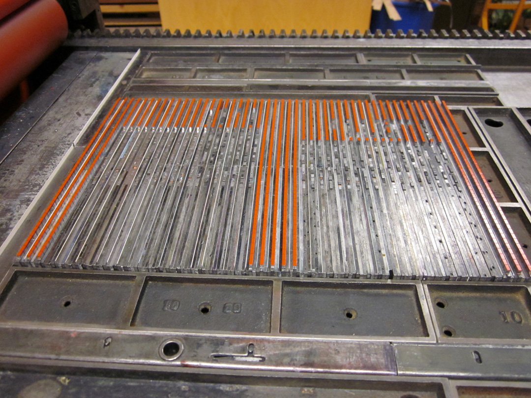
AGAINST PRESERVATION: THE VISTA SANS WOOD TYPE PROJECT
Hatch Show Print’s motto is: “Preservation Through Use.” When they say this they are talking specifically about their collection of historic type & image blocks. They “preserve” those physical things by continuing to use them and keeping the iconic images that they produced circulating in the culture. The idea of “preservation through use” is an oxymoron—using those blocks is not going to preserve them. That use is going to destroy them.
Generally speaking, when it comes to Book Arts & letterpress printing, I am against preservation. Not that I want to see all of our lovely tools, equipment & materials burned & scrapped. Quite the opposite, actually. I am against preservation in the sense that something that needs to be “preserved” is something that has died, that is in the process of rapid decay. The preservation impulse in Book Arts, while noble & in some ways worthwhile, is holding it back.
Letterpress printing, hand bookbinding, small/private press publishing, etc., etc. are commercially obsolete. That does not mean they are “dead”—historically over, sealed shut, capable of no further development in aesthetics and/or technology. The Economy is not the only economy. These things—these techniques, tools, equipment, processes, materials, ways of doing-learning-moving—are living things. & there is, terrifyingly, excitingly, more work to be done.
The Vista Sans Wood Type Project gets at several very important things:
1) It literally advances the technology of type production & letterpress printing. There is now a typeface that was never available as type, in lead or wood, in the world in physical form. And the type is different from traditional wood type—some of it has a very visible grain. It is not so precious anymore—it can be kerned, mortised, cut, spliced without worry. It points toward even more possibilities.
2) The project is not just about the type, it’s also about its utility & function. The functional/shareable is the new relational.
3) The project is not just about the type, it’s also about how it’s used to advance the aesthetic range of letterpress printing. You can see lots of the prints in the video above. Very few of them look like a “traditional” letterpress broadside. & that points to one very, very important thing about letterpress printing—it’s an extremely flexible & adaptable medium. The pinnacle of its aesthetic achievement was not/is not black, serifed text type on white or off-white paper.
4) The project is not just about the type, it’s about community, about this community of incredible people making incredible things.
Things like the Vista Sans Wood Type Project are absolutely crucial to keeping the fields of book arts, printing, typography, design, publishing, etc., etc. moving & interesting & fun. Tricia & Ashley have already made the type, but now they need some funds to make a book documenting the project—a book that will take the project even further. Please consider helping them out by following the link at the end of the video or by clicking here.
20121130
PRODUCTION IS RECEPTION (50): THE NEW MANIFESTO, SECOND ITERATION (1)


Because the new New Manifesto is being written:
The NewLights Press is an independent printer & publisher of experimental writing and artists’ books, concentrating on where the two can and do overlap. All of the books are printed & bound “by hand,” using a variety of techniques, ranging from the obsolete (letterpress) to the utilitarian (laser printing). We try to maintain inclusive (& purposefully problematic) definitions of such mutable terms as “experimental writing,” “artists’ books,” and “printing techniques,” and to be similarly inclusive in the kinds of books that we produce, in an attempt to allow the different kinds of production to merge, separate, and converse with one another. We believe in the actual use value of art objects as soft, temporary spaces in and against which individuals & communities can envision & articulate their relationship to, and shape in, the world. We are not searching for the Ideal Book—we are looking hard at, & reading deeply of, the Book-in-the-World. We represent only one of the many geographical/historical meeting points of a vital and diverse community of active, thoughtful people, and our work would mean nothing without that community. The production of books is our own way of telling the rest of the world that we believe in them.
20121108
PRODUCTION IS RECEPTION (50): THE HEADS (9)

It is hard to be aware of how little one pays attention to something. Big things are moving in Art & Life these days, and the mornings, usually reserved for writing blog posts, have been filled with the meditative work of cutting and peeling paper. So there’s that. But today some time to write a bit about the nighttime activities—the continued adventures in the printing of The Heads (of My Family, My Friends, My Colleagues) by Justin Sirois.

In earlier blog posts and on the NewLights Facebook page, there are some cryptic photos and descriptions of the “pixel grid” of The Heads. So I thought I’d explain a bit about what that actually is, how it works. These images are a bit old now—production has advanced to some later stages/colors. But more on that soon.
In the designs of other NewLights books where I was printing from photopolymer plates I tried to make that decision to use the plates count—to use the plates to print a book that only could have been made with them. For The Heads I wanted to try something different: to use a combination of good ol’ laser printing with letterpress, and to see where that led the book. This helps keep material costs down (those plates & films are expensive) and is appropriate for the content of the poems, which talk about life and images on, off and between our screens.
So the pixel grid. It is made from lead type, specifically from spacing material for lead type. With the assistance of the nice people at the M & H Type Foundry I was able to get 10 lbs. of 12 pt. en quads in “high spaces”—spaces that are a bit higher than regular word spaces. (I believe that these spaces would normally be used to support the kern of letters at the end of a word, say the “f” in “of,” but I’m actually not sure about that.) So with the high spaces I can still use regular spaces as spaces, and regular leading to hold the lines. And that negative space is important—it is what makes the grid do its work.


So the columns of the gird are assembled in lines, with copper spaces between each piece vertically, and 6 pt. slugs and paper leading (equal to 1 pt. in thickness) between them. The gaps in the columns will form the letters of the poem titles (the titles are all all-cap “acronyms” like TFIEG), made from the modular alphabet described in earlier posts. The grid itself, when complete, will contain groups of three columns in different colors—made to emulate the RGB grid of the screen. So the spacing matrix is assembled to print all of the red columns on a single page spread, and then it can be broken apart/reconfigured to print all of the green columns by just moving it 6.5 pts over in the press bed. And then the blue after that. I am doing all of a single color first, so there is a great deal of reconfiguring before the press runs containing titles. The lines of spacing are extremely prone to falling over at the ends, so it has taken me some time to get into the haptic rhythms of working with them effectively. But now things are moving. The text, the grids, the book, accumulate.


20120924
WE HAD A READING HERE IN THE SPRINGS ON FRIDAY NIGHT & IT WAS FUCKING AWESOME & IT FEELS SO GOOD TO BE HOME
It was the first reading in a new series called “Say Hello to Your Last Poem.” The readers were Matt Potter, a promising & motivated Colorado College student, and Corina Copp, a fantastic poet from Brooklyn & author of Pro Magenta/Be Met (Ugly Duckling Presse, 2011). The series is being organized by Noel Black (author of Uselysses, also Ugly Duckling Presse, 2011) and myself, and it was held at the home of Noel and his wife, artist/curator Marina Eckler. They have this incredible house with a backyard that extends up to a red rock outcropping, like a mini national park, and that’s where we did the actual reading, with crazy colored lights and the vastness of the sky & mountains behind the readers. It started with a potluck dinner and just the right amount of people came out. Everything synced.
So why am I making such a big deal out of a little house reading? It’s not a novel format, even here in the Springs, which has a thriving house-show-music scene. And one would expect a good reading from two good poets. Hey, no big deal.
& “no big deal” is absolutely correct, which is why it was awesome, and which is why I am excited about it & the future of doing this. Because these things don’t have to be a big deal, and they’re often better if they’re not. All one needs is an interested & loving & awesome local community. & we’ve got that here in Colorado Springs, believe it or not.
The people, the place, the work, the event itself. It’s all there, shimmering, and on top of all that I realized what’s been missing from the work of the NewLights Press for far, far too long—being anchored in a community, one that is both local & reaching out & welcoming in. (It’s been since the early days in Baltimore, when we were organizing readings, making chapbooks, and having a great & terrible time all of the time.) I’ve often said, on this blog and elsewhere, that one of the most important & vital parts of small press publishing is the community, the community already established, and the community that the making & sharing of work is constantly building. But in all of my transience over the last 8 years (!) I had forgotten that literally bringing people together is one of the best parts, one of the most important parts.
I had somehow forgotten about the interplay between the work produced (the writing, the books) and the local-right-there-and-giving-you-hugs audience, about how important those flesh & blood & laughing people are, and about how work made in that environment can become an anchor point for a shared, lived experience.
More readings? Yes.
More books? Yes.
We hope to see you all here soon.
20120910
PRODUCTION IS RECEPTION (49): THE HEADS (8)

Nothing like a weekend of technical failure to reinvigorate the spirit. This weekend was reserved to begin printing the “pixel grids” on the pages of The Heads (of my family, my friends, my colleagues), the forthcoming book of poems by Mr. Justin Sirois.
Those grids are being printed from lead matrices constructed from spacing material—“high spaces”—in this case 12 pt. En quads. This first set-up was supposed to be the “matrix-matrix,” the modular set-up that would yield all the others.


I eagerly set it up on Saturday, anxious to see if it would actually work, knowing that I would probably have to adjust it, but hoping beyond hope that I wouldn’t. It printed:

But as I had guessed, there won’t be enough white space between the individual “pixels” in a column. In the above image you can kind of see them, but once they are printed with more impression & ink, those tiny cracks will fill up. So I thought, Okay, no big deal, I’ll just add some paper spaces between all of the lead pieces.
& besides I had forgot to reverse the matrix for printing, so it was all going to have to come out anyway.
Little did I realize that all of my schemes for producing roughly 3,500 6 pt. paper spaces would also fail. After messing around with the guillotine for a bit, I decided that I could set up the lines in InDesign, print ‘em out & cut them by hand. But that didn’t work either:


So it looks like I’ll be ordering a bunch of 6 pt. coppers.
Luckily, there are other pieces of the book that I can work on while I’m waiting on those. So I don’t have to waste any more time.
& speaking of wasting time—one thing we like to say around here is that “learning is making mistakes.” I sure am doing a lot of learning on this one….
20120824
AL-MUTANABBI STREET STARTS HERE: THE ANTHOLOGY IS OUT!

The anthology of written work from the Al-Mutanabbi Street Coalition has been published by PM Press & is now on sale. Here’s the description from the PM Press website:
On March 5th, 2007, a car bomb was exploded on al-Mutanabbi Street in Baghdad. More than thirty people were killed and more than one hundred were wounded. This locale is the historic center of Baghdad bookselling, a winding street filled with bookstores and outdoor book stalls. Named after the famed 10th century classical Arab poet al-Mutanabbi, it has been the heart and soul of the Baghdad literary and intellectual community. This anthology begins with a historical introduction to al-Mutanabbi Street and includes the writing of Iraqis as well as a wide swath of international poets and writers who were outraged by this attack.
This book seeks to show where al-Mutanabbi Street starts in all of us: personally, in our communities, and in our nations. It seeks to show the commonality between this small street in Baghdad and our own cultural centers, and why this attack was an attack on us all. This anthology sees al-Mutanabbi Street as a place for the free exchange of ideas; a place that has long offered its sanctuary to the complete spectrum of Iraqi voices. This is where the roots of democracy (in the best sense of that word) took hold many hundreds of years ago. This anthology looks toward al-Mutanabbi Street as an affirmation of all that we hope for in a more just society.
For more info (including a complete list of contributors) & to order a copy of the book, go here.
I have been involved with the Al-Mutanabbi Street Coalition for a few years now (see the NewLights broadside here and some notes for a panel presentation here), and I am consistently amazed by the unwavering dedication of this group and of its founder, Beau Beausoleil. In addition to the initial broadside project and this anthology, there is now also an artists’ book project. I have heard Beau say many times that the project (in its broad sense) is not an “anti-war” project, nor is it a “healing” project—it’s about looking hard at violence, how it affects people & their culture, and about not looking away.
Buy this book.
20120820
NOW (NON)LIVE ONLINE: CLERESTORY
Otherwise known as “the JAB book,” or “as-of-yet untitled.” This is a tricky one to translate to digital form, because the book is dependent on the reader being able to really stick their nose into it to read the pale text, and to be able to turn the book to read it in its multiple directions. So to help out a bit, here are two versions of the finished book, in different orientations. We highly recommend using the zoom feature on the reader to get to all of the text. & the thing in the middle is an all-digital study using the original photographs in sequence.
Image/Text by NewLights Press: Aaron Cohick, et al.
16 pages, saddle stapled
4.0625” x 8.125” (closed)
CMYK offset of digital photographs (printed by Brad Freeman, Jenna Rodriguez, & Claire Sammons at the Center for Book & Paper Arts at Columbia College Chicago), letterpress from photopolymer plates
Edition of 600
2012
This book was made as an insert for the Journal of Artists’ Books #31. More info (including how to get yourself a copy) here.
20120815
A SHORT FILM ABOUT THE PRESS AT COLORADO COLLEGE
This is a short documentary about The Press at Colorado College, the institution and studio to which the NewLights Press is symbiotically attached. The film was made by a student apprentice at The Press, Demetria Humphries. It's a really great little film, and I was honored to be a part of it. It's got lots of great letterpress action!

20120806
NOW (NON)LIVE ONLINE: THE DROWNABLE SPECIES by BRIAN EVENSON
& this post is the fulfillment of another long-term goal for the NewLights Press Digital Archives: in the spirit of The William Blake Archive, not one, but three complete copies of The Drownable Species by Brian Evenson.
Why three? Because the process of making these books (detailed here) was rooted in chaos and variability, taking advantage of the unpredictability of water and the often unnoticed physicality of inkjet printing. Each book in the edition is different, and three seemed like the right number to allow readers to see how those differences emerge from copy to copy.
All of the other archived books on this blog are either out-of-print or unique. The Drownable Species is still available for purchase. It originally was published in late 2008 (right around Halloween actually) after 3 years of on & off labor. I am still very proud of this book. & now it’s more accessible. & if you enjoy the story, it was very recently published in Brian’s newest collection of short stories, Windeye (buy here and reviews here and here).
The three copies that have been digitized are numbers 6, 29 and 34.
The Drownable Species
Short story by Brian Evenson with images by Aaron Cohick
Short story by Brian Evenson with images by Aaron Cohick
48 pages, hardcover, casebound, 8 ¼” x 5 ¼”
Letterpress printed text, digitally printed images with hand manipulation
Variable edition of 40
2008
20120727
DURATION, SEQUENCE & STRUCTURE (5)
[Editor’s Note: This series of Duration, Sequence & Structure posts is a text/image version of a collaborative talk that was given by Kyle Schlesinger and I at the 2012 College Book Art Association conference in the Bay Area. One section will be posted every day of this week. This is the last.]
[KS] In What You Will, the language is layered both in the printing and in the text itself. Unlike many of the works discussed in Craig Dworkin’s Reading the Illegible, the legibility of the poems was in no way compromised by the printing, nor were the poems written specifically for this book form. Spaces within spaces, books within books, with all four elements visible simultaneously. I get bored when there aren’t at least two things happening at once, but I’ve never been interested in noise for the sake of noise, and/or artists’ books that are essentially one-liners talking over one another (or any other kind of book for that matter). As I recall, in 2009 Aaron asked me for some work and I sent him eighteen new poems. When he received the manuscript, he thoughtfully asked right away if I had any thoughts about how the book should be, and I said something like, “you know how much I admire your work, so please, do what you will.” (or did I just say this to myself and title the manuscript thereafter?) The poems in this book take on quite a few different forms (the shortest poem is just two words, the longest is four pages) and yet I feel that the short line holds it together. The line is a unit of measure that I’ve been working with for the last five years, combined with a somewhat street-wise vocabulary. Almost all of the poems are occasional and contain found language, often from several sources within a single piece, but the sources aren’t as important as the relationships between elements, the contrast that can be introduced by a diverse palette of words and phrases that sometimes result in unexpected twists that keep the poem moving forward, at other times making for awkward moments that create something of an intentional acoustic or visual fumble (such as typos or successive clichés).
Reading is an experience that unfolds in time—the letters build up into words, the words into sentences, and the sentences into a text. The codex has a specific sequence and a sophisticated hierarchical structure designed to honor the author’s intention. Traditionally bound books are often divided into chapters rationally organized in ascending order, as are the corresponding page numbers which are conveniently listed in the table of contents, while the index creates a complex network that is easy to cross reference among identical copies of a given book; i.e. the third word of the third sentence in the third chapter of the first edition of Moby-Dick is intended to be the same in every copy. But artists’ books and poetry often don’t rely upon such conventions, which is one of the reasons that the two genres have such a rich and intertwined relationship. The time of a book (unlike the time of a dance performance, film screening, or bus ride) is subjective and determined by the individual reader. Poetry is rarely read cover to cover, and poets know this. Are the rules for reading a traditional codex any more defined than strategies for reading artists’ books? How are these strategies informed or obfuscated by collective reading environments? When is one “done” reading? Does the book begin the same way it ends? Is experience a reading that in time unfolds—text into sentences, sentences into words, words into letters?
20120726
DURATION, SEQUENCE & STRUCTURE (4)
[Editor’s Note: This series of Duration, Sequence & Structure posts is a text/image version of a collaborative talk that was given by Kyle Schlesinger and I at the 2012 College Book Art Association conference in the Bay Area. One section will be posted every day of this week. This is the fourth.]

Andy Warhol, Saturday Disaster, 1964, synthetic polymer paint and silkscreen enamel on canvas
[AC] Reading is an experience that unfolds in time—the letters build up into words, the words into sentences, and the sentences into a text. Both the text, with its letters and words, and the book, with its frames and pages, are ordered, accumulating multiplicities. A recent collaboration between Kyle and myself, a book of Kyle’s poems called What You Will that was published by my NewLights Press, attempts to make this idea of accumulating multiplicity, which is essential to every book, visible and legible to the reader and crucial to their understanding of the poems. I’d like to talk about some of the concepts that fed into What You Will in terms of three different examples, which are, moving from the general to the specific: pop and high-modernist/minimalist artistic strategies, the form of the traditional codex, and the actual poems that make up the book.

Andy Warhol, Marilyn Diptych, 1962, acrylic on canvas
In terms of multiplicity, Andy Warhol’s early screenprinted pieces do one crucial thing in terms of investigating the mass-printed/produced image—they show the entirety of the “edition” on the same surface. These pieces show the multiple nature of the mass-produced image-object all at once. This is an image of the image-object, in its repetition and in its difference, never single, never quite the same in each iteration. One of the many effects that these pieces demonstrate is the dislodging of the signifier from its referent through repetition, similar to the way a word starts to sound like gibberish when we say it over and over again. In the book The Return of the Real, art critic Hal Foster briefly mentions the idea that repetition has done more work than abstraction towards disrupting the language of representation: “For abstraction tends only to sublate representation, to preserve it in cancellation, whereas repetition, the (re)production of simulacra, tends to subvert representation, to undercut its referential logic.” Repetition, in these pieces by Warhol, allows for a “making strange” of the language of the mass-produced image.

Frank Stella, Six Mile Bottom, 1960, metallic paint on canvas
The “stripe paintings” of Frank Stella are so nihilistically perfect in their collapsing of form and content that it’s hard to think of them in terms of representation at all, sublimated or otherwise. As objects, “you see what you see,” and their total lack of reference, and depth, and composition, forces the viewer or reader to consider their status as objects—are these paintings or sculpture? And to consider how they were made—are these stripes, one after another, in compositions not really based on choice, applied without traditional “painterly” finesse, really painting?

And when you look at the series of Stella’s paintings next to one of Warhol’s images, they start to tell us something more about this idea of “accumulating multiplicity,” of difference and repetition, and, as Foster noted in a comparison of minimalism and pop more generally, something about “the series,” or serial production, in American culture at large. Because these pieces are paintings we don’t usually think of them in terms of time or duration, but that is an aspect of them, brought out through this idea of accumulation, of “one thing after another,” of repetition, of difference.
We say that the book is a time-based form because it takes time to move through a book. The book itself, in the sense of its “pure” or uninflected technology (bound but blank pages) presents what is essentially the same event over and over again—a page turns, a page turns, a page turns, and so on. This is a multiplicity, but an ordered, ideal, uninflected one—all repetition. When content begins to crawl over the pristine surface of the pages the multiplicity becomes far more chaotic. Now the ideal measure of the page is inflected, varied. Now, we can read the book, and reading brings us into the realm of duration.

These are some examples of Kyle’s poems. As you can see, they are mostly tall and skinny, and they make a strong vertical mark on the page. Reading them, I thought mostly about structure—how words connect to other words, how the lines of the poems build up, move, repeat, rearrange, and disarrange, within one poem but also from poem to poem. These poems are not piles of language, they are columns, or skyscrapers, carefully built, one brick after another.

This idea of structure really came to the foreground when I saw that the table of contents for the book was essentially another poem—a poem based literally in structure and accumulation.

The next few images will show some successive page spreads and details from What You Will.


The poems themselves are the white text in the black stripe on the left of each page. The width of the stripe is determined by the length of the longest line of the individual poem. To the left of each poem is printed a mirror image of the text, in transparent gray, with the successive poems stacking up and merging as one continues through the book. All of the structuring principles of the text and of the book are immediately made visible on every page.

The covers were made by printing every single plate from the pages in white, on black paper, in exactly their position on the page, showing the entire open book at once.

The jacket contains all of the information that would normally be on the jacket of a book (title, author’s name, press name, etc.) collapsed and layered into single lines and in two reversed arrangements. The book functions in, and demonstrates, both idealized, spatialized time, and indivisible, overlapping duration.
20120725
DURATION, SEQUENCE & STRUCTURE (3)
[Editor’s Note: This series of Duration, Sequence & Structure posts is a text/image version of a collaborative talk that was given by Kyle Schlesinger and I at the 2012 College Book Art Association conference in the Bay Area. One section will be posted every day of this week. This is the third.]


[KS] And sometimes the text does change, rekindling the old adage: you can’t step in the same book twice. Bolinas poet Robert Grenier’s Sentences, published by Whale Cloth Press in 1978 is one instance of a book’s structure having a direct effect on the reader’s understanding of the poem. Sentences consists of five-hundred poems that could be described as minimalist in nature, each of which is printed on one side of a 5 x 8 inch card, and the cards are housed in a Chinese box complete with ivory clasps manufactured in Hong Kong. Unlike the poet’s other books, the loose cards invite the reader to shuffle the stack, revisiting the text anew each time. Paradoxically, Michael Waltuch, Whale Cloth’s publisher and designer of Sentences, told me that when he was in the Rare Book Library at the University of Pennsylvania discussing his work with some students, he unclasped the box, cut the deck, and began shuffling the book, reading the short poems in a randomized, rapid sequence. He said the librarian nearly fainted! Apparently, the library had preserved the original (arbitrary) order of the cards for twenty-five years, urging their patrons to never, under any circumstances, place the cards in the “wrong” order. I might have had a similar idea in mind when I made A Book of Closings in 2005.

I had been reading Keats’ odes and thinking about the way poets say goodbye, formally and informally. I began writing down all of the closings culled from Irving Layton and Robert Creeley: The Complete Correspondence, 1953-1978 in my notebook. Then, I wrote them down on index cards and sorted them, avoiding any repetition.


The closings were printed letterpress on cardstock and housed in a blue paper folder of sorts. I didn’t attribute particular closings to a particular author, in part, because I’m interested in that mysterious third element that is introduced in any relationship or collaboration, and of course, who could resist the bookbinders’ pun on the absence of signatures in a book composed entirely of loose cards? The form allows the reader to randomly rearrange the lives, and more importantly the relationship lived through letters by the poets.


[AC] Reading is an experience that unfolds in time—the letters build up into words, the words into sentences, and the sentences into a text. That text is at once continuous and fractured. We see it as a line, moving relentlessly from the beginning to the end, but that line is precarious—shot through with cracks, fissures, breaks, white space. The line is an accumulation of fragments. The line is an accumulation of voids. The largest gaps occur in the transition from page to page, through the gutter or around the fore-edge. These are the crucial non-spaces of reading, when the technology of the book rushes up to meet our attention, when our conception of time asserts its artificiality; yet we, as readers, steadfastly ignore it. The lines of text and the blocks of the pages divide and spatialize time—sometimes arbitrarily, always artificially. Artificially because we don’t read like that, we don’t experience books in the way that the things themselves like to imply—in a straight line of perfectly divisible units in strict sequence. The text does not pass by our fixed viewpoint like the frames of a film. We read, we stop reading, we get distracted, we pet the cat, we back up, we start again, we read, we start to fall asleep, “it’s a little warm in here,” we read, we stop, we read, “did you remember to?” We flip to the end of the chapter to look at an endnote, we read, we stop, a word or phrase reminds us of something, we read, it’s time to eat, we grab a bookmark and wedge it into the space of the gutter, we close the book and now it’s all fore-edge again, now we’re back at the beginning. We walk away. We come back hours later. We walk away. We come back days later. We walk away. We come back years later. The text does not change, but it’s a different book every time we pick it up.

[KS] And sometimes the text does change, rekindling the old adage: you can’t step in the same book twice. Bolinas poet Robert Grenier’s Sentences, published by Whale Cloth Press in 1978 is one instance of a book’s structure having a direct effect on the reader’s understanding of the poem. Sentences consists of five-hundred poems that could be described as minimalist in nature, each of which is printed on one side of a 5 x 8 inch card, and the cards are housed in a Chinese box complete with ivory clasps manufactured in Hong Kong. Unlike the poet’s other books, the loose cards invite the reader to shuffle the stack, revisiting the text anew each time. Paradoxically, Michael Waltuch, Whale Cloth’s publisher and designer of Sentences, told me that when he was in the Rare Book Library at the University of Pennsylvania discussing his work with some students, he unclasped the box, cut the deck, and began shuffling the book, reading the short poems in a randomized, rapid sequence. He said the librarian nearly fainted! Apparently, the library had preserved the original (arbitrary) order of the cards for twenty-five years, urging their patrons to never, under any circumstances, place the cards in the “wrong” order. I might have had a similar idea in mind when I made A Book of Closings in 2005.

I had been reading Keats’ odes and thinking about the way poets say goodbye, formally and informally. I began writing down all of the closings culled from Irving Layton and Robert Creeley: The Complete Correspondence, 1953-1978 in my notebook. Then, I wrote them down on index cards and sorted them, avoiding any repetition.

For example, “love” seemed to be a popular closing, especially as the two poets came to know one another more intimately. I decided that “love” with a comma was different than “love” with no comma, just as “love from Mallorca” was certainly different from “love from Betty and me.”

The closings were printed letterpress on cardstock and housed in a blue paper folder of sorts. I didn’t attribute particular closings to a particular author, in part, because I’m interested in that mysterious third element that is introduced in any relationship or collaboration, and of course, who could resist the bookbinders’ pun on the absence of signatures in a book composed entirely of loose cards? The form allows the reader to randomly rearrange the lives, and more importantly the relationship lived through letters by the poets.

20120724
DURATION, SEQUENCE & STRUCTURE (2)
[Editor’s Note: This series of Duration, Sequence & Structure posts is a text/image version of a collaborative talk that was given by Kyle Schlesinger and I at the 2012 College Book Art Association conference in the Bay Area. One section will be posted every day of this week. This is the second.]

Richard Artschwager, Book, 1987, Multiple of formica and wood
[AC] Reading is an experience that unfolds in time—the letters build up into words, the words into sentences, and the sentences into a text. The act of reading is one of the fundamental elements that differentiate books from other art media. I saw the artist Richard Artschwager speak in Baltimore in 2002. In the lecture Artschwager demonstrated his concept of the difference between painting and sculpture. He said, and I’m paraphrasing here, “you look at a painting like this [mime standing in place and staring at a painting] and you look at a sculpture like this [mime walking completely around a 3D object].” To that I would add, you look at a book like this: [mime examining the exterior of a book by flipping and rotating in the hands, then opening it and paging through]. If we were to accept Artschwager’s approach and define the form of an artwork by how it’s viewed, then the book is 2D—viewed from a fixed point, and 3D—viewed from all angles, and 4D—the book has to be moved through as well, and that moving through takes time. Can the book be thought of as an image of time?
[AC] Reading is an experience that unfolds in time—the letters build up into words, the words into sentences, and the sentences into a text. The act of reading is one of the fundamental elements that differentiate books from other art media. I saw the artist Richard Artschwager speak in Baltimore in 2002. In the lecture Artschwager demonstrated his concept of the difference between painting and sculpture. He said, and I’m paraphrasing here, “you look at a painting like this [mime standing in place and staring at a painting] and you look at a sculpture like this [mime walking completely around a 3D object].” To that I would add, you look at a book like this: [mime examining the exterior of a book by flipping and rotating in the hands, then opening it and paging through]. If we were to accept Artschwager’s approach and define the form of an artwork by how it’s viewed, then the book is 2D—viewed from a fixed point, and 3D—viewed from all angles, and 4D—the book has to be moved through as well, and that moving through takes time. Can the book be thought of as an image of time?
[KS] The book remains our most sophisticated storage unit “of” and “in” time, our most reliable means of recording texts and images, of retrieving and receiving information and ideas. The Canadian artist Michael Snow’s 16 mm film So is This (1982) begins: “This is the title of this film. The rest of this film will look just like this. The film will consist of single words presented one after another to construct sentences and hopefully (this is where you come in) to convey meaning.”

Snow’s experimental silent film does what it says it will do: white words set in Helvetica appear one by one against a black backdrop, building on one another to form sentences.

The narrative is linear, self-reflexive, ironic, (even funny) and driven by the relationship between its subject (language) and time.

So is This builds and deconstructs simultaneously, often humorously: “This, as they say, is the signifier.”

As in any film, some shots are longer than others, but in So is This, the time spent on one word does not have a direct correlation to the aesthetic value of the image (I mean, it’s all Helvetica) or the narrative.


The irregular rhythms play with the viewer’s patience, desire and expectations.

Cinema, since its beginnings, is nothing if not an image of time, an image in time, and Snow’s film is no exception, but perhaps what sets it apart from most films is that it is an artists’ book. I know, I know, we’ve all been down that road one too many times, but I would say that the discourse of artists’ books lends a useful vocabulary to the problem (both poetic and cinematic) posed by Snow’s film, which is 45 minutes in length. I’m less interested in what something is or isn’t than the lexicons we can borrow from in order to understand a thing as something other than itself. In this talk about time and sequence and technology, it is important to note that the time of this film (which happens to be a text in the literal sense), is universal. I was living in Berlin when I rode my bicycle to the kino. The screening began at eight o’clock and was over at quarter of nine. Everyone in the theatre saw (and read) the film at the same time and in the same time. Unlike the book, if the viewer misses a word in cinema, a sentence, there’s no going back. Time marches on, but duration doesn’t, which is why it seems to me a more appropriate term than “time” for the book arts discourse. Films, dance, theatre and other performances are time-based art forms, in part, because the audience observes the work together, in the same time, eight o’clock till quarter of nine, while the book is generally experienced one reader at a time. The book steps out of that time sequence, out of sequence, out of time: enter duration.
[Note: The complete So is This can be watched on Ubuweb.]
20120723
DURATION, SEQUENCE & STRUCTURE (1)
[Editor’s Note: This series of Duration, Sequence & Structure posts is a text/image version of a collaborative talk that was given by Kyle Schlesinger and I at the 2012 College Book Art Association conference in the Bay Area. One section will be posted every day of this week. This is the first.]
[KS] Beginning at the beginning is difficult. Where does the book begin? I hand you the book, a book you’ve never seen before, and your experience of it begins. Although you don’t know this book, you know it is a book because the image of it resembles books you’ve seen before. You take it in your hands. You thumb the fore-edge, grasp the spine, turn it around, read the title, open it, snap it closed, read the last blurb, get bored, read the title again, adjust the dust jacket, feel nervous, self-conscious. So you break the tension, you ask me to sign. Pencil or pen? You smile, I laugh. Receiving the book is a strange performance or ritual. The book stops you, asks you to ask yourself what you’re doing. What are you looking for when you open it? A good book is a good question, not an answer, not “about” anything or anyone. What can you learn from the book before reading (as such) begins? How do you enter? The book doesn’t stop, which is why it is useless to describe the book in terms of “time.” The book goes on—doesn’t miss a beat. It doesn’t need me. You either. The book I am reading now isn’t the first, but it might be my last: any book, anywhere, anyone, anytime. This book is one in a sequence of books within an ever-broadening memory of the object. There is no book, only books. The book eludes you the moment you perceive it. It will always be incomplete, a sequence of points of perception that split the past and the future. The book is already gone.
It was he told me I'd begun all wrong, that I should have begun differently. He must be right. I began at the beginning, like an old ballocks, can you imagine that? Here's my beginning. Because they're keeping it apparently. I took a lot of trouble with it. Here it is. It gave me a lot of trouble. It was the beginning, do you understand? Whereas now it's nearly the end. Is what I do now any better? I don't know. That's beside the point. Here's my beginning. It must mean something, or they wouldn't keep it. Here it is.
—Beckett, Molloy
[KS] Beginning at the beginning is difficult. Where does the book begin? I hand you the book, a book you’ve never seen before, and your experience of it begins. Although you don’t know this book, you know it is a book because the image of it resembles books you’ve seen before. You take it in your hands. You thumb the fore-edge, grasp the spine, turn it around, read the title, open it, snap it closed, read the last blurb, get bored, read the title again, adjust the dust jacket, feel nervous, self-conscious. So you break the tension, you ask me to sign. Pencil or pen? You smile, I laugh. Receiving the book is a strange performance or ritual. The book stops you, asks you to ask yourself what you’re doing. What are you looking for when you open it? A good book is a good question, not an answer, not “about” anything or anyone. What can you learn from the book before reading (as such) begins? How do you enter? The book doesn’t stop, which is why it is useless to describe the book in terms of “time.” The book goes on—doesn’t miss a beat. It doesn’t need me. You either. The book I am reading now isn’t the first, but it might be my last: any book, anywhere, anyone, anytime. This book is one in a sequence of books within an ever-broadening memory of the object. There is no book, only books. The book eludes you the moment you perceive it. It will always be incomplete, a sequence of points of perception that split the past and the future. The book is already gone.
20120716
NOW (NON)LIVE ONLINE: ART INTO LIFE
It is really exciting to finally get a complete version of this up online. As was mentioned in the previous “Faking It & Making It” posts, the idea of doing some kind of reproduction or archive copy came shortly after this book was completed in 2005. And when I first realized that doing online versions of the book was finally a real possibility, this book was the big goal. & now here it is.
Due to limitations on file size I had to divide the book into three sections—I didn’t want to sacrifice image quality. It is actually one 180-page book. There is one fold-out section towards the beginning, which will look strange when you come to it, but hopefully it will make sense. Be sure to click on the pages to zoom in and read the footnotes!
Art Into Life
Altered book with text and images by NewLights Press: Aaron Cohick, et al
180 pages, case bound, 8 ¼” x 5 ¾”
Digital printing, collage, delamination, and mixed media drawing
Unique
2005
20120712
FAKING IT & MAKING IT (5)

All of the digitally archived NewLights books show their edges. If you look closely (at What You Will, for example) and watch the transition from spread to spread, you’ll see that the edges are in flux—they slide back and forth and wobble crookedly against the edge of the digital document. If you look toward the spine you’ll see that the shadows cast by the book don’t match up, and sometimes, even the edges of the cover or jacket don’t either. Look a little bit past the book toward the digital edge and you can see the boundary between the image and the file that holds it—mismatched approximations of gray or black or white. The reality of the image bleeds through.
Often when I picture these archived books in my mind (another ideal space), they float against a pristine white background, shadowless and perfect. It is obviously possible to make that ideal a reality in the realm of the digital, but it seems counterproductive. These are not ideal objects, they are as imperfect as our shabby bodies, and to hide that fact is to actually withhold information from the reader. & the archive is a functional object—it gives you the content as well as an image of the form, as completely as it can.
(I’m writing this post in the ideal light of the early morning, a bit hazy from the nearby wildfire, [ Editor's Note: This post was actually written a while ago, while our fire was just beginning, before our city started to burn.] as the pages of The Heads of My Family, My Friends, My Colleagues, a new book of poems by Justin Sirois, are being digitally printed. I can hear and see the pages flex and wobble as the machine pulls them in. I am clearing jams. I can see that they are not straight, not lining up from back to front. This is going to be even more obvious once I start the letterpress printing. I have accepted, planned for, the imperfection of the physical-digital. Hopefully the design is successful enough to take advantage of its oscillation.)
The design and production of the actual NewLights books focuses on making their technology visible, on directing the reader’s attention to the window: by fingerprinting it, cracking it, taking it out of its frame and asking the reader to hold it for a second. Those ideas are important, foundational, to all of the books that NewLights makes. My initial concerns about, and resistance to, digital archives and/or physical facsimiles grew from the idea of the seamless image of the facsimile—if the books themselves insisted on showing their seams and how they were made, how could I justify another version that would hide those same things? But the translation to the digital form allows new opportunities, allows for more layers of information, allows for more richness, and allows more people to access the experience of all those things. Sure, a physical facsimile could do the same thing, but I’ve got a lot of other printing to do, first-order printing, if you will. One last thought in regards to all of these posts and the recent Call for Proposals from The Center for Book & Paper Arts at Columbia College Chicago: the digital archive insists, to a certain degree, on the reproductive functionality of the digital medium. But what happens (and this is a huge question in Book Land right now) when the digital becomes first-order as well?
And by the way, the digital version of Art Into Life will be going up on Monday.
Subscribe to:
Posts (Atom)


