20120530

PRODUCTION IS RECEPTION (48): THE HEADS (7)

Now we’re getting somewhere. Not sure where that where is yet, but we’re almost there.


20120523

PRODUCTION IS RECEPTION (47): THE HEADS (6)

Fig. 05.12.09
A detail from the initial series of type sketches (see previous Production is Reception post), showing some beginning display letters, potentially for use on the title page of The Heads.


Oh, it’s so much fun not to have any idea what I’m doing. Well, sometimes it’s fun, other times it’s nerve-frying and soul-twisting. But that’s part of the fun too. So here we are with another post of me bumbling through “lettering design.”

Fig. 05.12.10
First of new series of drawings specifically for the title type. The regular alphabet letters at the top show a brief flirtation with the idea of lowering the crossbar on the “A.”


These letters began with a slightly taller version of the regular alphabet (see Fig. 05.12.09), but as I recreated these digitally and enlarged them, I realized that they should be drawn at actual scale (using the same base grid) as that would allow for more variation in the design (like having a stem with a width of 3 blocks instead of a multiple of 2).

Fig. 05.12.11
Figuring out the shapes and trying out decorative elements—the “serifs” or “beaks” on the “T” and “E.”


So more drawings, then. No need to bore you with the details. I’m still not totally happy with these, but we’ll see where it goes. And of course the position on the page, along with any other text (the rest of the title, author name, press name, etc.), will play a huge role in how they look at the end.

Fig. 05.12.12
The final? Perhaps….


I’m still sorting out, still thinking through, what this kind of activity means for the larger process of making books (for NewLights—so the large but local sense), of making books strange. & of course this is just the design stage—setting these things in lead, manipulating and printing them, is going to be another matter entirely. But the activity in & around & through these letters is energizing and informing the whole process in a new way for me. Which is always the point when figuring out any new book.


20120518

PRODUCTION IS RECEPTION (46): THE HEADS (5)

& The Heads will contain my first (somewhat) legitimate foray into type design. As you may have deduced from earlier “digital sketches” that were posted here (here & here), the design of the book is tied to the idea of RGB color, in particular to the RGB phosphors that allow our precious & pernicious & delicate screens to show color.

Fig. 05.12.01
First sketches. The grid was set up on the computer and printed out so that I could work by hand. 12 pt. en quads, a 1:2 grid.


So, a grid, then, in red, green & blue. And type for the titles composed of, built out of, that grid. Letterpress printed from spacing material, flat rectangles of lead, ordinarily the physical component that makes a blank space on the printed page, now arranged in a pixel grid, raised up, inked and printed. The trace of the non-space, the brilliant color of the mutable absence.

Fig. 05.12.02
Working with variations on the letterforms.


The design of a modular typeface is a pretty basic typography exercise. But since I don’t know much about type design it seemed like a good place to start. (Thinking with Type by Ellen Lupton and Lettering & Type by Bruce Willen and Nolen Strals, have been my guides.) & it has certainly been instructive. Even within a rigid system there are many variations of a letterform that can be created (see Fig. 05.12.02).

Fig. 05.12.03
The top alphabet contains some lowercase forms. The bottom is closer to the final designs, with each letter being made up of an odd number of “pixels”—1, 3 or 5. Except for the ampersand, formed from an “E” and “t,” and four “pixels” wide.


The titles for the poems are in all caps, so the designs are only for those letters (& the ampersand), done at actual size. These initial drawings were done by hand. I think that when they’re actually printed, they will rest somewhere between the unevenness of the drawn versions and the cleanliness of the digital renderings (see Fig. 05.12.08).

Fig. 05.12.04
Drawings for the potential “decorative” letters for the title pages. Some tests of kerning the letters, and variations of the “Y” in context.


I liked some of the earlier versions with a “modulated” stroke, but after conducting a few tests with the actual titles I determined that the best option would be a “condensed” typeface. And then it was a matter of refining the system and looking for workable, related shapes for the letters. I experimented with lowercase forms for some of the more problematic letters (B, D, R, K), but eventually settled on only using the lowercase form for the “N,” while the “Q” is both capital and lowercase (see Fig. 05.12.03).

Fig. 05.12.05
The final alphabet at the top, and renderings of the actual titles.


But there is always the title page(s) and cover as well. So maybe there will be a more decorative version (see Fig. 05.12.04). Bigger though.

Fig. 05.12.06
More renderings of the actual titles. Playing with word spacing and the “TT” and “TTT” ligatures.


Putting the letters into use in the actual configurations of the titles yielded new problems. The form of the “Y” was determined by how it looked in a specific title (YSYSYS, see Fig. 05.12.04), as that title was the most heavily patterned. Problems of spacing also became apparent, particularly with the “T,” so I decided to use ligatures when there was more than one “T” in a row (see Fig. 05.12.06).

Fig. 05.12.07
More titles. Some redrawn with the ligatures. The letterspacing is still not perfect on the grid, but the ligatures work better.


These letters, honestly, are the put of the book that I am most unsure about at this point. Partly the design of the letters themselves, partly the technical aspects of actually printing them, and partly how they will drive the overall design and feel and experience of the book. Too much? Too weird? Too bright? Too big?

Fig. 05.12.08
The clean, digital alphabet with some title tests. The printed versions will not be this clear and consistent.


But these are the risks that come along with a challenge.

20120516

PRODUCTION IS RECEPTION (45): THE HEADS (4)


& that’s when things started to get strange (any Thing that is strang).

I always wonder about how much I want to detail in these process posts, about how much of the book I want to show before it’s done. But here we go again, anyway, what else can we do?

One of the primary concerns whenever a NewLights book is being developed is how to make the book GO—how to reach into the text (whatever that “text” may be maybe) and pull out its strangeness and translate that to the physical-temporal book object itself.

This process often terrifies me, because it runs the real risk of real failure.

But hopefully that means that I’m on something. Still, the doubt is always there, twisting in my stomach. What follows is an example, the first nervous part of The Heads.


All of the poems have bizarre titles, in all caps, like:

IMATAYM
ATTWD
WAPAUSHTGOWYLD
NSIILTOBIGOTB

I am very intrigued by these titles. I don’t know what they “mean.” But I do know that I want to draw attention to them, and that they could or should be a major design element of the book.

“Design element?” Maybe that doesn’t go far enough. I struggle with the word “design” in this context. It’s too removed, too after-the-fact. Too much about “presenting” the text. What we want is to produce the text(-book-object), enact it. Not to make a crystal goblet, but to distill the complex, intoxicating drink itself.

A writing alongside the writing. A writing underneath the writing. This process often terrifies me. The book twists in my stomach.


20120515

PRODUCTION IS RECEPTION (44): THE HEADS (3)


It is not so much a case of determining the success (or in this case FAILURE) of the experiment—it is a matter of bringing to light problems not seen in the original hypothesis.

20120509

PRODUCTION IS RECEPTION (43): THE HEADS (2)

THE HEADS

*

OF MY FAMILY:

OF MY FRIENDS:

OF MY COLLEAGUES:


For Rodchenko/For Travis/For J (again):
Working Notes Toward The Heads #FFFFFF

NewLights Press: Justin Sirois & A. Cohick
3 digital books, 64 pages each, 8” x 12” (open)
Pure RGB colors
Edition determined as viewed
2012
Free

20120507

ALMOST ADOLESCENT


A recent acquisition, as we gear up to print The Heads by Justin Sirois. This is the theme of YEAR 12.


This past Saturday (05/05/12) was the twelfth birthday of the NewLights Press. To be perfectly honest, the anniversary came and went and I barely noticed. Always too much to do in the day to day, and always too many year cycles to keep track of—the “real” year, the academic year, the NewLights year, the year of the lease, etc. But this seems like an appropriate time to ruminate on what happened, and what will happen….

Not a bad year! The one before, 2010, was the slowest (read: impossible for me to find time & energy) for NewLights ever, so last year, and a whopping two publications, makes me feel like things are heating back up again. In some ways this work moves glacially slow, but in other ways I feel like I can never keep up. I learned a great deal last year—I’m sure I will always be “figuring this out” for as long as I am making books.

I still have no idea what I’m doing.

But the most important question is, as always: what is NewLights doing?

More books! Definitely this year The Heads by Justin Sirois, and hopefully something by j/j hastain, Divya Victor, and a New Manifesto. More other things! A new (non-delaminated) broadside/poster series called “Words to Live With.” Maybe some short run chapbooks in conjunction with a still-forming reading series here in the Springs. Maybe a little magazine. Definitely a presence at the Codex Fair in February 2013, and it looks like a gallery show, the first for NewLights since 2007, in March/April. Which brings back the question of just which “art world” this work participates in….

And more digital archives of out-or-print books, including redesigned, re-edited, and newly accessible versions of the DIY Books.

That other press is coming along too.

I’m getting nauseous just thinking about all of this. This kind of fun is so unsettling.

Thank you all for reading. Thank you all for giving this a purpose.

20120502

NOW (NON)LIVE ONLINE: THE BOOK 1: THE MOVEMENT-IMAGE


Text and images by Aaron Cohick-Gilles Deleuze-Eadweard Muybridge

56 pages, softcover with printed dustjacket,
double signature pamphlet stitch, 8” x 5”
Letterpress printed dustjacket and covers with digitally printed text pages
Edition of 50 

2007 
Out of Print

You might notice a bit of strangeness in the middle of this one. The double-signature pamphlet stitch puts a flap form the covers in the middle of the book. They turn like pages in the real thing, but I had to “fake it” for this digital version.

20120426

LUCKY ME

that I ended up on the analog mailing list of Pointed Press. Here are some images of their latest postcard:


20120423

PRODUCTION IS RECEPTION (42): THE HEADS (1)

I sat down here today (it’s early here today)

& said, “I’m going to write something

powerful!” & then I said, “That’s the

worst fucking idea I’ve ever had.”

The lines above are the first stanza of HTAYKSSS, a poem by Justin Sirois, that will be in his new book, the next new NewLights book, The Heads. Yesterday as I retyped those lines they made me think of my own early morning writing, the writing that often ends up on this blog.

And so we begin to collect the brilliant pieces of the last month, a month engaged in intense discussion and thought about the thing, the usual thing, the every-thing, the making of books. We will see if we can make this last month into a “turning point.” I have a feeling now that those can only occur retrospectively. The most important thing is the follow through.

Work has begun, in a real way, on The Heads. I spent the weekend retyping the poems. Retyping wasn’t necessary in terms of efficiency—I was retyping them from the printout of the text doc that is already on my computer. Retyping is a way to really, almost literally, spend some time in the poems.

Retyping is an activity that grows out of my experience of setting texts in lead type. It allows me to get to know the texts in a way different from the (often too ephemeral) experience of reading, even of close reading. One has to look at how the poems are built—how is capitalization handled? Just how much space is there between these lines? Just how far should those indents go? Etc.

Editing and designing a book tend to be more “big picture” activities. Retyping the poems is a way of getting to know the forest by looking very carefully at the individual trees.

Retyping also turns the poems sharply towards me, as I prepare to reproduce, to multiply, them. The first imprinting of the book occurs in my consciousness. The trick now is to make that individual experience and imprinting many, multiple, public, shared, accessible, wondrous, etc.

Going carefully through the poems again this weekend also made me remember how much I believe in them, how excited I am to have the chance to help make them a part of the world. They were made strange. I couldn’t believe them.

& so it begins again &

20120413

CHAPBOOK LECTURE & POETRY READING IN DENVER ON SAT. 4/21


Anyone on the front range interested in small press biz/poetry/art should go to this event at Counterpath in Denver:
Saturday, April 21, 2012, at 7 p.m. at Counterpath (Denver), join us for “Buy, Sell, Trade: The Chapbook Press in the 21st Century, and the Story of Ugly Duckling Presse,” with a talk and presentation by Ugly Duckling Presse founder Matvei Yankelevich and a reading by Ugly Duckling Presse author Noel Black.

Full info here.

20120409

FROM THE ARCING AIR


This image is a shot of a broadside by Ugly Duckling Presse, on display as part of a chapbook show, curated by Marina Eckler and Matvei Yankelevich, at the Coburn Gallery at Colorado College. Photo by our new friend Jeanne Liotta.

A valid question: where have I been? I often ask myself that same thing.

There are of course no good answers. I have been away from this space for awhile now, because I am in over my head teaching a class about DIY/small press publishing with Matvei Yankelevich, poet and (one of the) editor(s) of Ugly Duckling Presse. It has been amazing, and as we move into the last week and a half it’s just going to get better. There will be more details about all of that on The Press Blog, eventually.

But the class and the events of the past couple weeks will stretch beyond their casual boundaries. Things are stirring here on the front range. In the next couple of weeks on this blog look out for some more digital editions of out-of-print NewLights titles, in particular the fully realized and downloadable DIY Books.

A good friend who I don’t get to see very often anymore told me about going skydiving, and there was one aspect of the experience that had never occurred to me—the profound quiet of it, of drifting slowly through the empty air. The thought of actually skydiving terrifies me, but there’s something about the idea of that quiet that I can’t let go of. Once I can find the courage to jump everything that NewLights does will emerge from that quiet. It’s always this.

20120321

SPACE TO WORK


A couple of years ago a good friend let me borrow a copy of Lawrence Weschler’s Mr. Wilson’s Cabinet of Wonder (New York: Vintage Books, 1995), which is about The Museum of Jurassic Technology in LA. I recently bought my own copy, mainly because of the following passage, mainly because I think a great deal about finding or making the necessary space to do the necessary work. The passage in question (p. 59 – 60) talks about Hagop Sandaldjian, a microminiature sculptor from Armenia:
[…] I ended up speaking with the master’s son, Levon, who explained that there was in fact something of a tradition of such microminiature art back in Armenia (he knew of two or three other such instances), although, as far he knew, his father had been the world’s only microminiature sculptor. “He would wait until late at night,” Levon said, “when we kids were in bed and the rumble from the nearby highways had subsided. Then he would hunch over his microscope and time his applications between heartbeats—he was working at such an infinitesimal scale that he could recognize the stirrings of his own pulse in the shudder of the instruments he was using.” […]

That is an excellent description of what it takes to find the necessary space. I often think about, try to imagine that infinite quiet, just a brief interruption in the unstoppable flow of the world.

20120319

FIRST STEPS

Towards what will be a long (and hopefully significant) project. These images are of some very quick tests—the same image/text printed twice on the same piece of paper, run through a laser printer two times. The question: is there poetry in that dislocation?


20120315

A PORTRAIT OF FALCONS ON THE FLOOR AS ST. BARTHOLOMEW


Flayed. Get your complete copy here.

20120314

A FEW THINGS THAT I WOULD LIKE YOU TO KNOW ABOUT, ABOUT INDEPENDENT PUBLISHING AND BOOK ARTS AND WAR AND WHAT YOU WILL

Texts/essays about independent publishing have been on my mind a great deal lately, probably because I will soon be participating in a class about independent publishing, probably because that’s what I do. The librarian in me wants to archive these things, but this is the best I can do for now. Two texts, one a post by Roxanne Gay on HTMLGiant, the other from Derek White of Calamari Press (brought to my attention via HTMLGiant). These are a bit old now. They are still good, of course, and worth sharing (and archiving):

Roxanne Gay on Tiny Hardcore Press
Derek White on Calamari Press

The fifth anniversary of the bombing of Al-Mutanabbi Street in Baghdad just passed, and there has been a lot of activity among the members of the Al-Mutanabbi project, which was recently expanded to include artists’ books. You can read about and see some of the books here. Here is an article in The Huffington Post about the project as a whole. In the article Beau Beausoleil, the driving force and organizer, talks about why he felt it was important to do the project, and why he thinks it is still important. Sometimes it is crucial not to look away.

In other news about the intersection of book arts and war, the Combat Paper Project is trying to raise some money through Kickstarter. The drive is almost over, and they have already reached their goal, but every little bit helps. Here’s the link to the site and the video:


And finally, finally, speaking of war, speaking of the end, speaking of peace, there are only THREE COPIES of Kyle Schlesinger’s What You Will left for sale. And then that’s it & that’s it.

20120312

WAKING, CATCHING UP, WAKING


My apologies for the lack of posts lately. The NewLights Press has been very busy, to the point where these silent mornings of writing had to be used for catching up on sleep or for going in to work early. But now a new book is done, the book labeled As-Of-Now Untitled in the last few “Production is Reception” posts, the book made to be an insert in JAB 31. It has a title now: Clerestory. The images above and below are from the binding. 600 copies, our largest edition yet. They should be going out with the new issue by April 1st.


Maybe it’s Daylight Savings Time, or maybe it’s the winter slowly receding, but I feel like this somehow marks a turning point for NewLights. A subtle one, for sure. A turning point that will almost certainly only be perceptible to me. We shall see. Somewhere in here is a new beginning. Maybe because that last book was essentially about new beginnings, the new beginnings given to us all each day. We all have our own ways of marking time.


The tests that I conducted for the printing of Clerestory were also secret tests for the next book, The Heads by Justin Sirois. The tests determined that my idea for the book was not going to work (see above). So it’s back to the beginning on that. Always these new beginnings, but what a great place to be.

And it seems appropriate to leave this morning’s meditation with the message that has been sitting on my desk for a few weeks now, that will soon be added to the wall in front of my desk so that I can see it everyday. It’s from the ILSSA, and it speaks for itself:


[A quick note about the image above: the scan doesn't really do the actual object justice, as that orange you are seeing is actually fluorescent ink on the real thing. These screens have their limits.]

20120224

PRODUCTION IS RECEPTION (41): AS-OF-NOW UNTITLED (7)

The book is very far along now, ready to go to press. But still there is no title, even this far into it. In fact, I keep forgetting that it needs a title until I write these blog posts. (I always just refer to it as “the JAB book.”) There is no title yet because there is no front matter, no title page, no spine, no cover, etc. So no to place to put a title means no title. Perhaps it is “no title” instead of “untitled.” We’ll see.

The last post about this book talked a bit about the colophon, which has been difficult to write. That difficulty was mostly caused by uncertainty about the form and the length. For awhile I thought that I needed a much longer colophon than I had originally anticipated, and spent days trying to add to it. But then it got too unwieldy, too bloated. So for the sake of the text, of the writing, I reconfigured the form of it. I think the new form (pictured below) is actually much more effective. And the whole thing is shorter, much more “to the point” while still maintaining the “poetics” of the “main” text. Everything always comes together in the end, but it’s important to remain critical and flexible until that moment when it all comes into focus.


Here is some more of the text, from the “end,” but there is no end really, as this thing is just really getting started now:

—what comes next; the world, the world; pushed up and trembling; shabby thing that it is; the morning; and waking; again; here; here; here; here; here; here; like that; just like that; but different this time; this time it’s different; this light; changed; but suspended the same; the color; different now; and thin; congealing; bare; and projected; the objects; the world; the same; lovely just the same; lovely just the same; lovely just the same; lovely just lovely in the light like that; as it changes; as it is suspended; and projected; and above; and folds beneath the hands; always folding; always turning; turning bare and scraping; the text of this; a new scar for every new day; every new day a new scar in this holy book; the surface shimmers, is broken; but there is always this pushing through; always this light; this color; never the same and very rarely different; but it congeals, hopelessly; joyfully in this bursting light; the world is filled with it; unbelievable; it can hold up so much; so much fragility; always there; hanging; about to dream again; about to wake again; the world is filled with it; bare and scraping—

& this is where we can begin, thankfully. The pages of the book turn, turn constantly, like the hands of a clock. The reading of the text is the most subtle, slight turning of the pages. We barely see it. And then when it really happens it happens so quickly. We barely see it. We were asleep after all. And just waking, now, in this new page. But it did not begin here. But it always begins here. We barely see it. We love what we know comes next &

—suffused with the holy work of the morning; unstoppable in the reaching paleness of this light; this home; this page; this work; this home; this page; this work; this home; this page; this work; this home; this page; this work; this home; this page; this work; this home; this page; this work; this home; this page; this work; this home; this page; this work; this home; this page; this work; this home; this page; this work; this joy; this love; this home; this light; this bareness scraping always against the text; this home; these books; these mornings; this morning; this joy; this bursting; this book; this writing; this unbelievable light; never would have thought; this joy; every; every; every; every; every; every; day; love; terror; this joy; this holy work; this holy work; this is the morning; this is the morning; this is the morning; this is how it should be; wants to be; always; this holy morning and this holy work; this pale light and warmth reaching through; this home; this page; this work—

& this is where we can begin, thankfully. The pages of the book turn &

20120220

NOW (NON)LIVE ONLINE: THE INFERNAL METHOD


Open publication - Free publishing - More artists books

Text/object by NewLights Press: Aaron Cohick, et al.
12 pages, no cover, saddle stapled, 7” x 5.5”
Letterpress printed on newsprint, with additional elements added by hand
Edition of 350
2009
Released as part of Issue #3 of Mimeo Mimeo.

20120215

MORE THINGS TO SHARE: DENVER ZINE LIBRARY

The Denver Zine Library is running a fundraising campaign. It’s a library for zines. This is a small, important, importantly small thing. Below are two videos. The first is their intro video, and the second is their 2 week update, just posted to the fundraising page today. And here are some links—one to the fundraising page where you can make a donation, and the other to the Denver Zine Library main site.


20120213

MIMEO MIMEO #6 IS OUT & AVAILABLE, and AN INTERVIEW


Issue number 6 of the great magazine Mimeo Mimeo is out and available for purchase. Here's the official description from the Mimeo Mimeo blog:

Mimeo Mimeo #6: The Poetry Issue will soon be on newsstands everywhere featuring new work by eight poets who have consistently composed quality writing since the golden era of the mimeo revolution. Contributors include Bill Berkson, John Godfrey, Ted Greenwald, Joanne Kyger, Kit Robinson, Rosmarie Waldrop, Lewis Warsh, and Geoffrey Young.

Beat the crowds and have a copy delivered to your door hassle free. Each copy packed and personally addressed with care by the editors of Mimeo Mimeo. Just click on the "Buy" button on the right and select your location. It's as easy as that.

Buy it here.

& I am very honored to be included in Rob McClennan's series of interviews with small press publishers. He asks some good questions. You can read that here. Thanks Rob!

20120208

POEMS & PICTURES AT COLUMBIA COLLEGE CHICAGO


Poems & Pictures: A Renaissance in the Art of the Book (1946-1981)

Opening Reception
Thursday, February 9: 5 - 8 PM

Poems & Pictures features books, paintings, collages, periodicals, and ephemera that explore fundamental relationships between form and content; seeing and reading; writing and drawing; and the extraordinary occasions when these things and activities fuse, introducing a third element.    

Poets, artists, and collaborators in this exhibition include Wallace Berman, Joe Brainard, Robert Creeley, Jim Dine, Philip Guston, Joanne Kyger, Emily McVarish, Karen Randall, Larry Rivers, George Schneeman, and many more [including NewLights!]. Together they share in the common objective of bringing bold new writing into print where commercial presses fear to tread, and to do so with imagination and intelligence. 


Poems & Pictures originated at The Center for Books Arts in New York and is curated by Kyle Schlesinger.

More details here.

20120207

PRODUCTION IS RECEPTION (40): AS-OF-NOW UNTITLED (6)


A big challenge in the writing of this new book has been the colophon. Ordinarily NewLights colophons are very simple—just the info that seems important, without too much “ornamentation.” But this one will be a little different, as I want to integrate it with the main text. The book, theoretically, will have no clear beginning or end, no cover, no endsheets, no title page, and no front or back matter. But it needs to have a colophon, particularly because it’s a collaboration, printed partly by other people in another place. It’s important that their work is acknowledged.

The image above shows the current layout for the pages and colophon (sort of). The colophon is the larger text running around the perimeter of the pages. The pages will literally be framed by a description of their own production. I’m not sure if it’s all working yet, either textually or visually. But here’s the newest colophon text. It’s not long enough yet. It doesn’t fit right. But here it is:
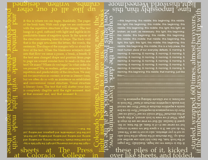
It might also begin here. Every book has its edges, its boundaries, tracing its body in the morning. Somehow, like this morning, this book was made. By hand, by machine. By a persistent light in the morning, once barely there, now stronger, now struggling with its fullness. Most often we should just let it sleep. But the light accumulates, answers fitfully, in pieces, layers. These photographs were taken by the author, in the morning, with its light, its edges, its fitful sleep bashful and lying, now standing, in the light. They were built up, printed, layer upon impossibly thin layer (thinner than these pages, these sheets in this crawling winter morning), offset by Brad Freeman and Print Production Fellows Jenna Rodriguez and Claire Sammons. How could these mornings happen in Chicago? The book is always many places, times, stutters. These mornings are everywhere, but accumulated, printed at The Center for Book and Paper Arts at Columbia College Chicago, as an insert for JAB 31. Unbelievable then, how these mornings were quietly made in the rushing of machines. The text happened later, piled up in the days, piled up like all of our other crumbs, written, designed and printed, made with light, made with photopolymer plates and scraped against these sheets at The Press at Colorado College in Colorado Springs. Every morning new, the light just beginning to trace us, these books coughing in the dark. Every morning new, NewLights Press: Aaron Cohick, et al, the text, these piles of it, kicked over like sheets, and folded, stapled, wrapped. 600 times, almost two years, if the numbers of our days ever matched up with time. Impossibly thin, this light, this world. We need more layers, more fullness, here in the bare winter morning. We pull the sheets closer, and the books fall back to stuttering and dreaming. Our days, our homes, our places of repetition, of joy, of new light all the time. We love what we know comes next.

20120203

OFF TO IOWA


To talk with some people about books. Go figure. See you on Monday.

20120201

NOW (NON)LIVE ONLINE: 7:8:1


7 one word poems of 8 letters or less by various authors 
Including contributions from: Lauren Bender, Anselm Berrigan, Aaron Cohick, Jeremy Sigler, Hunter Stabler, Nate Wilson, and John Yau

24 pages, softcover, saddle stapled, 4 ¼” x 9”

Letterpress and screenprinted cover with photocopied text pages

Edition of 100 

2003
$3 – currently unavailable

This is an older book, from 2003, before I really had a clue as to what I was doing but having a good time trying to figure it out. The roughness of this and the other older books has a certain kind of charm, at least for me. But perhaps I’m just getting nostalgic.

You’ll notice at the end of this book that it says “tin woodsman editions” along with “NewLights Press.” Tin woodsman editions was a second imprint that I was using briefly, that was supposed to be for cheap, fast books in large editions. At the time, I think I was thinking of NewLights as making “nicer” books and thus felt the need for a second imprint. Tin woodsman was abandoned when I came to the conclusion that NewLights is and was a press that produces many different kinds of books.

I do like this “one word” idea though, and it may be making a comeback very soon….

20120130

LOCAL-IZING (2)

Speaking of community, I’ve been thinking a lot lately about how to get this blog to include contributions from other people. I’ve always hoped that it could be a resource for others engaged in similar activities, but perhaps it can also be a channel of communication for that community as well. My first thought on how to do this was to do simple profiles of other small presses and makers of artists’ books. But then it came to my attention that someone else is already doing that, has been doing it for awhile, and is probably doing a better job than I would. I haven’t given up on that idea completely, but I need to figure out how to steer it in a different direction.

And then, of course, there could also be interviews. And there will be interviews—in fact, this post is the first one (Really! Keep reading!). I thought it might be interesting to do the interviews with groups of people, asking one question about a particular topic. As usual, I’m doing everything on the fly, in the morning before I go to work, so I haven’t quite refined the system to have received multiple answers that I would post all at once. I’m excited about this first one, so it’s going up now. Here it is: a question about community, directed to Adam Robinson, the proprietor of the great Publishing Genius Press in Baltimore, MD.

NewLights: Publishing Genius is based in Baltimore, MD, and frequently publishes work by Baltimore writers. Does Publishing Genius make it a point to publish work by local writers and artists? And why? And are there other activities around publishing that you see as important for fostering local community?

Adam Robinson: Initially, I didn't have any intention of publishing writers local to my community. In fact, I didn't realize until last year that a significant portion of PGP books were from Baltimoreans (7 out of 18, basically). Then, when I did realize it, it came as no surprise. It made sense, not because Baltimore has a particularly rich literary community (which, as you know, it does), but because I seek out like-minded people, and I become friends with them, and I pay close attention to what my friends do. I do feel like it's one of my goals to promote my community's culture, and interestingly that is another way of expressing myself, personally. By publishing Megan McShea's book (forthcoming), I'm saying, "This is who I am, or what I want to be like." However, does this foster local community? I mean, it bolsters Baltimore's writers outside of the community, but I'm not doing a great deal to get the books into the hands of this city's residents. But one aspect that I think does foster the community, something that you pointed to in your blog post, is bringing in outsiders for the event, and showing them around town. Taking them to the amazing local literary hotspots like Atomic Books and Normals. Introduce them to people by hosting readings and encouraging the exchange of ideas. And not just that, but publishing and reading translations, I think, has been on my mind a lot lately. Because it's an important question: what is a community. There are worlds within worlds. Before I'm a Baltimorean, I think, I'm an artist. That links me with other artists, regardless of location. So I want to know what my fellow art citizens are doing in Spain and Iraq and Singapore. This last bit is perhaps more ethereal than the practicalities influencing your question, it's basically where PGP has been since starting out -- that the literature community takes priority over the municipality -- and yet 40% of the books are by writers who live within 10 miles of me.

Hopefully there will be more of these soon, hopefully they can be presented together. (Of course they can.) If this is a question that you’d be interested in answering, please let me know at newlightspress-AT-gmail-DOT-com.

20120126

LOCAL-IZING (1)

On Monday I had the good fortune to see Ralph Nader speak at Colorado College. It was a great talk, focused on the increasing “corporatization” of American life & politics. (You can watch the whole lecture here.) He didn’t just talk about how bad things are, but gave lots of simple, practical suggestions for people to get involved and begin to change things. So, naturally, I wondered: what can I do, personally? And not just what can I do in terms of getting directly involved with politics/civics, but what can I do, what can the NewLights Press do, to integrate this kind of responsibility and action into daily practice?

One of the ideas that came out in the talk was the idea of “displacement” of large corporations by local businesses and economies—an idea very important to (and already well developed in) the building of more sustainable and responsible agricultural practices. But what is a local economy/ecology for writing and art? What role can small presses play in developing that local culture in a positive way?

One could argue that small presses, by nature of their being small, only participate in a local economy. But when I look at NewLights particularly, it’s quite clear that we haven’t engaged with our home community in a purposeful way in a long time. NewLights has published work by writers from all over the country—most recently by someone from Austin, TX, who was living in NYC when we started the project. J.A. Tyler lives in Fort Collins, CO (about 2 hours away from CO Springs), but publishing a Colorado based writer was an accident—that project began when NewLights was in California, before I knew that I might be moving to Colorado.

NewLights has resided in 4 different states in the last 8 years of its existence. The only place it was rooted in for a significant amount of time was Baltimore, where it began. So I could use the excuse that I’ve moved around too much to invest a lot in a local community. But that’s just an excuse, and now that things seem more permanent, the question returns: what can we do?

And the answer, very simply, perhaps too simply: publish Colorado writers! And when you do that organize readings and other events! Create a space-time for a community to develop! And when you work with a writer or artist from another place, get them out here to do an event, so that there is an exchange with other local economies! It really is that simple. But it’s also not that simple—more questions arise.

If the goal of the press is to publish “the best” writing that we can find (the “best” of our particular area of interest), then are those writers and artists going to necessarily reside in Colorado? And particularly in Colorado Springs? So what does it mean when, as a press, a commitment is made to publishing local work? Does that involve lowering our standards? Or will that commitment allow a space for that local work to grow?

I have a feeling we’ll come back to this….

20120124

NOW (NON)LIVE ONLINE: SOME BEES BY LAUREN BENDER

& another "digital reprint," this one of a NewLights classic, Some Bees, by Lauren Bender. These are erasure poems, written by selectively crossing out words from a dictionary. 


Poems by Lauren Bender
32 pages, softcover, saddle stitched, 8” x 5”

Cover is letterpress printed and hand painted on handmade sisal paper, text pages are laser printed

Edition of 50

2005

Out of Print

20120123

PRODUCTION IS RECEPTION (39): AS-OF-NOW UNTITLED (5)

Or maybe like this, just better, not as sloppy: