skip to main |
skip to sidebar
The image above shows the current state of the covers of Kyle Schlesinger’s What You Will. As you can see, printing on the verso (left) side of the covers has begun. They are 4 runs deep at this point. Hopefully printing on the jackets will begin tonight, after work.
Speaking of “work,” there’s been a lot of posts at The Press (at Colorado College) Blog lately, as I try to catch up on everything from last school year before this was begins. Recent highlights include a CMYK & delaminated letterpress broadside by Darren Wershler, and a book/broadside project integrated with Twitter through the use of a QR code. Check them out here.
Poet & printer Michael Cross, who used to publish wonderful books under the imprint Atticus/Finch, has started to publish wonderful books under a new imprint: Compline. The first book from that new press is C.J. Martin’s Two Books. Two Books is one the best looking books I’ve seen from a small press in a while. It’s very elegantly designed, small in size but with a heft to it (it’s a little bit more than 200 pages). The image at the top of the post shows the (digitally printed?) cover while this one below shows the simple and beautiful letterpress printed jacket. Find out more about the book, the author, and the press, and buy the book, here.
 The right half (recto) of the cover of What You Will is complete: 44 runs. 17 remain on the verso. And then 28 on the jacket. Because I am back “on the clock” at the Press at CC, production is being adjusted slightly—I will print the jacket, 1-2 runs per session on weeknights after work, and do the cover, 2 runs per session, on the weekends. The runs on the cover are 4 times as long (2 covers x 2 sides) as the runs on the jacket. So now both pieces will develop simultaneously, and hopefully there will be images of both as they build up.
Long projects like this, with lots of printing, always help me generate new technical ideas as I’m working. Things happen that I did not anticipate, sometimes those things are interesting. The important thing, as always, is to pay attention.
The right half (recto) of the cover of What You Will is complete: 44 runs. 17 remain on the verso. And then 28 on the jacket. Because I am back “on the clock” at the Press at CC, production is being adjusted slightly—I will print the jacket, 1-2 runs per session on weeknights after work, and do the cover, 2 runs per session, on the weekends. The runs on the cover are 4 times as long (2 covers x 2 sides) as the runs on the jacket. So now both pieces will develop simultaneously, and hopefully there will be images of both as they build up.
Long projects like this, with lots of printing, always help me generate new technical ideas as I’m working. Things happen that I did not anticipate, sometimes those things are interesting. The important thing, as always, is to pay attention.

 I am intrigued by the surface of the printed areas of these covers. I am also intrigued by the deboss/emboss of the large, “negative” type inside a solid block. The use of multiple impression depths in combination with figure/ground reversals seems promising.
This book was conceptualized and designed (and went into production) when I was still in the Bay Area, when I had no reliable access to lead type. I had to make the book with what I had access to: photopolymer plates. It made sense to me to convert that constraint to an advantage—to make a design that fit with & drove the work and could only be achieved through photopolymer. This is what led me to the transparent, mirrored letters and the “negative” type blocks. This book could not be printed digitally. This book could be printed offset. But then that’s where things like impression and other on-press interventions come in.
I have been asked why I don’t offset print the NewLights books. The answer, at times, is as simple as: because I don’t know how to run an offset press. It’s important to me to be able to participate, actively, in the production of these things. & now, to set these things up so that they require that active participation to function.
I am intrigued by the surface of the printed areas of these covers. I am also intrigued by the deboss/emboss of the large, “negative” type inside a solid block. The use of multiple impression depths in combination with figure/ground reversals seems promising.
This book was conceptualized and designed (and went into production) when I was still in the Bay Area, when I had no reliable access to lead type. I had to make the book with what I had access to: photopolymer plates. It made sense to me to convert that constraint to an advantage—to make a design that fit with & drove the work and could only be achieved through photopolymer. This is what led me to the transparent, mirrored letters and the “negative” type blocks. This book could not be printed digitally. This book could be printed offset. But then that’s where things like impression and other on-press interventions come in.
I have been asked why I don’t offset print the NewLights books. The answer, at times, is as simple as: because I don’t know how to run an offset press. It’s important to me to be able to participate, actively, in the production of these things. & now, to set these things up so that they require that active participation to function.
 When I was a graduate student in Arizona I lived my life in a series of small, windowless rooms: my studio apartment, my studio, and the letterpress shop at ASU. I referred to my various places as my “holes:” sleep-hole, work-hole, and type-hole, respectively. And then the other day I came across this passage in The Nature of the Book, by Adrian Johns (which is about printing & books in early modern England):
[…] A printing house, as already observed, must be represented as both private and public. One the one hand, it could not be open to all and sundry. The craft skills of the workers must remain mysterious, and it must be subject to the proper uninterrupted oversight of the master over his household. On the other, however, it must avoid being labeled “private” in the seventeenth-century sense, meaning illicit, secret, or seditious. Printers engaged in such dubious operations were said to do their printing in “holes,” or in “corners.” [Joseph] Moxon [1] defined a “hole” as “a place where private Printing is used, viz. the Printing of Unlicensed Books, or Printing of other Mens Copies.” That is, privacy immediately generated the two great evils of the trade: sedition and piracy. The notion was accordingly destined to become central to disputes over the status of printed materials. […] According to Moxon, printing in holes was lucrative and fairly common. There is reason to believe him. The Stationer’s Company certainly never lacked for spoils when it launched its periodic purges of offenders […]. Successive measures passed by both Parliament and the [Stationer’s] Company attempted to curtail such operations, […] aiming to discover “Printing-houses, and Presses erected in by-places and corners, out of the Eye of Government.” Parliament eventually ruled that printers must work only in “their respective Dwelling Houses, and not elsewhere.” […] The consequence is remarkable. It was not by chance that printing houses were set up in homes: the conjunction was formally obligatory. By corollary, a “private” press was one established anywhere but the space that society today considers archetypally private. Truth was made at home; lies emerged from holes. […] [2]
1. Joseph Moxon was the author of Mechanick Exercises on the Whole Art of Printing, published serially in England from 1680 – 1684.
2. Adrian Johns, The Nature of the Book: Print and Knowledge in the Making, (Chicago: University of Chicago Press, 1998.), 128-9.
& so back from my travels in the vastness of the west. & marking one complete year here in Colorado. My summer break from Colorado College ends today—this morning I go “back to work,” even though I was never away for that long.
The two months of this summer break seemed like such a luxury. Part of me felt guilty about having that time. And that time was wonderful, even though money was tight. My biggest fear going into the summer was that I would waste it, that I would not have the “get up & go” to get up & go to the studio every day and do the work. But I did, and even though things (of course) took longer than I thought, I still managed to get a lot done. A great deal of work still remains. As these long projects are finally drawing to a close, I find myself anxiously looking forward to a tentative batch of new publications. But first things must come first.
My hope in the coming months is to broaden the scope of both the NewLights Press and The Press at Colorado College. This is a state of permanent of transition. The only reasonable thing to do seems to be anchor that transition in production. And so we go again, one more day, one more day into the breach. A constant morning, both empty and full.
The world is there. The light strikes it lovingly.
 at these western lands. So this blog will be quiet until next week.
 “But wait,” they said, “how could a book supposedly printed in an ‘unlimited edition’ be out of print?”
& that is an excellent question. The New Manifesto of the NewLights Press is printed in an unlimited edition, but that edition will be comprised of successive iterations, each of those iterations being different versions of a single book. The different iterations will not be simply re-designed or re-edited versions of the same text/book, but will be entire re-visionings, based on what has been done before, and always looking forward to what could be done in the future. The book will be a literalization and activation of the reality of the text-in-flux, always immanent, always imminent. So each iteration is the same book. So each iteration is a new book. So The New Manifesto of the NewLights Press will be continually new continually.
The second iteration will hopefully be complete and released by the end of 2011 or beginning of 2012. From here on out, the first iteration will be available for FREE as a PDF—just email Aaron (newlightspressATgmailDOTcom) if you would like a PDF copy (maybe someday when NewLights has a “real” website it will be available for download). & it will also become our first experiment with an online edition, which will hopefully be up & accessible by the end of September 2011.
“But wait,” they said, “how could a book supposedly printed in an ‘unlimited edition’ be out of print?”
& that is an excellent question. The New Manifesto of the NewLights Press is printed in an unlimited edition, but that edition will be comprised of successive iterations, each of those iterations being different versions of a single book. The different iterations will not be simply re-designed or re-edited versions of the same text/book, but will be entire re-visionings, based on what has been done before, and always looking forward to what could be done in the future. The book will be a literalization and activation of the reality of the text-in-flux, always immanent, always imminent. So each iteration is the same book. So each iteration is a new book. So The New Manifesto of the NewLights Press will be continually new continually.
The second iteration will hopefully be complete and released by the end of 2011 or beginning of 2012. From here on out, the first iteration will be available for FREE as a PDF—just email Aaron (newlightspressATgmailDOTcom) if you would like a PDF copy (maybe someday when NewLights has a “real” website it will be available for download). & it will also become our first experiment with an online edition, which will hopefully be up & accessible by the end of September 2011.
“All I can tell you is what it feels like when you leave the studio…. it’s like you have a bunch of rocks in your stomach [and] then, all the trouble starts…. You have to go through it, like somebody preparing for sacred vows, the sensation of you putting paint on…. You do it and the work is done…. And then you leave the studio and those rocks aren’t there anymore.” [1][…] “To say that Stella, Warhol, and Smithson invoked the industrial is not to say that these artists worked literally to make machines, or sought employment in actual factories […]. What Stella, Warhol, Smithson, and other purveyors of the 1960s technological sublime intuitively understood was the need to play the codes: that is, to tolerate the seemingly necessary and always enforced ‘uniqueness’ of the art object and establish their own author-functions within art discourse (through statements, interviews, exhibitions), while simultaneously asserting and performing assembly-line production techniques, ‘executive artist’ efficiency, or geological agency that resonated with other cultural systems. […] [T]he artists of the 1960s unified the iconic [image of] and the performative [doing of] in the place of the studio (or, in Smithson’s case, in place of the studio), effecting this change across ‘styles’ and ‘isms’ as different as Minimalism, Pop, and Earthworks and expressing it in the useless objects of Art. That they sought (and achieved) a kind of sublimity (in technological form) is a measure of their ambition—to reach for that overwhelming response that had always been held out as the highest goal for American art. […] Stella’s praise of ‘executive artists’ and use of assistants in producing his brand was one unifying [of the ‘iconic’ and ‘performative’] move; another was Warhol’s conversion of studio into Factory, use of assembly-line silkscreen techniques on serial objects, and claims to delegate art production to ‘Brigid’ and ‘Gerard.’ A seemingly final, ‘post-studio’ stage was initiated by Smithson, who moved art production to the industrially mediated peripheries of abandoned quarries and mining sites, and located its meaning in discourse rather than in the object above all else. This was not some ‘Triumph over American Painting’ (to twist the standard paean against itself). It was an inversion and critique, an “anti-romantic anti-studio” dependent for its luminous salience on the Romantic constructs of an earlier age.” […] [2][…] “During the 1990s, many companies that had traditionally manufactured their own products and maintained large, stable workforces embraced what became known as the Nike model: don’t own any factories, produce your products through an intricate web of contractors and subcontractors, and pour your resources into design and marketing. Other companies opted for the alternative, Microsoft model: maintain a tight control center of shareholder/employees who perform the company’s ‘core competency’ and outsource everything else to temps, from running the mailroom to writing code. Some called the companies that underwent these radical restructurings ‘hollow corporations’ because they were mostly form, with little tangible content left over.” […] [3] Fig. 08.11.01 "Art is the ultimate luxury." Screenshot from http://www.daum.fr/en-eu/
Fig. 08.11.02 Bruce Nauman, Walking in an Exaggerated Manner around the Perimeter of a Square, 1967-68.1. Quote from Phillip Guston, 1966, reprinted in: Caroline A. Jones, Machine in the Studio: Constructing the Postwar American Artist, (Chicago: The University of Chicago Press, 1996), 1.2. Caroline A. Jones, Machine in the Studio: Constructing the Postwar American Artist, (Chicago: The University of Chicago Press, 1996), 57-8.3. Naomi Klein, The Shock Doctrine: The Rise of Disaster Capitalism, (New York: Picador, 2007), 359.
Coming home from the studio yesterday, I caught the end of Democracy Now! on the radio, where Amy Goodman was talking to Billy Bragg. They discussed many different and interesting things, but one exchange struck me particularly:[…]
AMY GOODMAN: But this is David Rovics’ other question. "You were on the ground floor of the punk rock scene that was sweeping much of the world in the late ’70s, early ’80s. What impact did the early punk scene have on society culturally and politically?"
BILLY BRAGG: Well, the thing that it did was it—the great thing about punk was it was DIY. You know, the year before punk rock broke, I went to see The Rolling Stones at Earls Court, in a massive stadium, some of the first stadium gigs in the U.K. The distance, culturally, for me, in row Z, and Mick Jagger, I had absolutely no concept of how I would ever get from here to there.
Within a year, I had been to see The Jam. The Jam were my age. They looked like me. They had the same guitar as me. They had the same attitude as me. And suddenly a light went on in my head. How do you do it? Well, you just do it. You don’t wait to be asked. You don’t have to be a brilliant musician. You don’t have to be the world’s greatest singer. You know, I’m not technically a great guitar player, as your viewers would have already worked out, nor, you know, do I have a fabulous singing voice. But I have an idea. And that is all the justification you need to stand up on this table and sing as loud and as out of tune as you want. I mean, Woody Guthrie did that. I do that. And that’s what punk was all about. It was in your face. It was all about attitude. It wasn’t a haircut. It wasn’t a pair of bondage trousers. It wasn’t a ripped T-shirt. It was about, this is what I’ve got to say, and you better listen, because I’m not going to go away until you’ve heard it.
[…]
Bragg’s response to seeing the Stones playing a stadium show is similar to the response that I have when going to a museum and seeing contemporary “museum” art—it’s big & expensive & spectacular & seems to come from a world totally different from the one that I (and my peers) inhabit.At this past College Book Art Association conference Ann Hamilton was the keynote speaker. She talked about her work, naturally. Her work, both big and small. Ann Hamilton is a very intelligent person (& she seems really nice too) and we have many interests in common, but I am definitely most intrigued by the simple, elegant videos that she makes with a tiny camera sitting at her kitchen table:& the pictures that she takes with her mouth:
 There is something to be said for work that one can make at home or with a relatively simple studio, without an enormous grant and an army of assistants. & I think I will be writing some of those things to be said on this blog this week. TO BE CONTINUED!


The images above show the cover of What You Will where it currently stands, 62 runs deep, with 26 on the left side now, and 36 on the right. Every plate used in the printing of the book is printed on the covers in white, in its exact location on the page, one on top of another. The books will be bound with a double-signature pamphlet stitch, so there are two cover sheets for every book, printed exactly the same on the front and back. So when the covers are folded and wrapped around and into the pages, the rectos of both sides of the cover will have all of the plates from the recto pages of the book, and the versos of the cover will have all of the verso plates of the pages. The layered structure of the entire book will be visible at once, both collapsing and exploding the pages.Printing right now is very routine: just switching plates, making slight adjustments to the position, and printing long runs (100 books x 2 covers per book x 2 sides per cover = 400 impressions per plate). Yesterday I was reminded of an incident in one my painting classes when I was in art school in Baltimore, an “incident” that at the time was small (a normal critique of work done in class) but looking back from here, that professor, was, in a way, predicting the future….The first semester of my sophomore year (Fall of 1999, the semester before I learned to print and started the NewLights Press) I was in a painting class that was based loosely around traditional techniques of figure painting in oils (glazing, etc.), but also featured a large amount of independent work. I was in the class mostly because I wanted to work with that professor, who was great. One day we were doing an in-class figure painting from a model. I was working on small, square canvas, and had set up a painting where most of the model was cropped off of the canvas and the majority of the composition was the white wall behind him. Because what I was interested in was painting that wall.And so I tried to paint the wall (on my canvas), but I really wasn’t trying to paint an image an image of the wall (I thought I was), I was just putting white paint onto the surface of the canvas and enjoying that. The professor stopped me and explained that I wasn’t really painting, in the sense of trying to make a picture, but that I was just “marking time,” making a series of essentially arbitrary brushstrokes on a surface. The only thing being articulated by those strokes was the time it took to make them.This was before I learned to make books. I thought of myself, more or less, as a painter. I was trying (not really trying) to be a “good” one. I had no idea what that meant. I was 19. I had not yet been pointed to the work of Robert Ryman, though it probably happened soon after this “event,” perhaps because of it: Robert Ryman, Ledger, Enamelac paint on fiberglass, aluminum and wood, 1982.
 Robert Ryman, Series #33 (White), Oil on canvas, 2004.That professor was pointing out that my engagement with that painting was an engagement with the raw or mundane or technological aspects of the process: making marks on a surface. That was a valid critique from his point-of-view, the point-of-view of the assignment, because we were supposed to be doing a figure painting from life. But sometimes critiques like that open up other doors. And I think that is one of the main things that made this professor good—he didn’t just tell me to stop and get back to the figure, but talked to me about what I was doing, helping me to see something in my approach that I was blind to. [Thank you, Karl.]So fast forward to yesterday. I was printing, white block after white block. And at some point I stopped, and thought: Am I just marking time?And the answer, at least for the moment, seems to be yes and no—yes, marking time, but no, not just marking time. Marking time because the time of the process of printing the book was being articulated on a single surface and distributed across the edition. Marking time because the temporal structure of the book would be legible at once. Not marking time because the surface of the page, and its 2D composition were also being articulated. Not just marking time because that time will be re-inscribed into the here-and-now of the reading of the book, of the reader’s understanding of the book as an object, as a made thing-in-the world.
I decided today that I will hereafter, at least in conversation, refer to “printing” as “partying.” That way I can say things like “I spent this entire summer partying,” or “I get up at 6 AM everyday so that I can start partying as soon as possible,” or “All this partying is just killing me.” Man, I can’t wait to PARTY ALL WEEKEND LONG.
This lovely tired morning and looking over the current draft for the second iteration of The New Manifesto of the NewLights Press. Here’s an excerpt:If we are to engage with the labor of making books we must not do so only in an effort to preserve them and the traditional crafts that go into making them. We must not lock them in the display cases, the glass coffins, of the museum. The book has a long history, but it is not, never has been, must never be, an object frozen in time. The book has a long history, but it is our job, as producers and readers, to make sure that it continues to have a living present. Everything that we cherish about books, about making them, reading them, owning them, collecting them, living with and through them, will be preserved if they continue to be culturally relevant. We must keep them out of the museums, out of the archives. They must live in our libraries, in our streets, in our stores, on our bookshelves, and in our hands.Books are not art in the traditional sense. Books do not require viewers. A book viewed is a book dead. Books need readers, and thus they must circulate outside of the venues of art alone. A book read is a book alive, breathing, beating, shining and reverberating through its readers.
The other day a friend of mine offered me space for a free ad in a publication that she was putting together (it was free because she ended up with 2 extra pages that needed to be filled quickly). I said yes. Then I was stuck with the odd task of making an advertisement for NewLights. I have never actually made anything that was strictly and discreetly an ad, at least for the press. So a new challenge. Strange to try to embody the whole thing in a single image/text composition. It is, after all, about movement. But the image below shows what I ended up with:
 A while ago I wrote a post describing the severe physical consequences of not storing one’s photopolymer plates properly. I never really tried to print those curled plates—I attempted to attach one to the base to see if it would flatten out, and it didn’t, so those never got used. But I did, at another time, for another project, manage to print from some plates that were severely warped.The pictures shown in this post are from January of 2011. [I had forgotten about them until recently.] Before I left the Bay Area in August of 2010, I had made the plates necessary to print the letterpress portion of KC Trommer’s and Brenda Iijima’s broadsides. Those plates were stuck in an envelope and shipped to Colorado, and then they sat at the Press until I made time to print them in January. Which means they had been sitting, with minimal protection from the environment, for roughly 5 months. I think that the envelope that they were in did keep most light off of them, and provided restraint against severe curling, but they were far from perfect. Fortunately, for these projects, less-than-perfect plates were okay. (All of the printed “negative” space on these would eventually be peeled away, so print quality did not matter.) And their less-than-perfectness provided some interesting results.
 Two things made these plates particularly prone to warping—the large amount of solid areas of type-high polymer, and the very dry climate here in Colorado. One thing that I was surprised about is that the plates don’t just curl, but that the actual surface can change shape over time.
 A not-flat printing surface means that solids are not solid. In some cases, the shapes of the letters were just barely visible enough to do the cutting.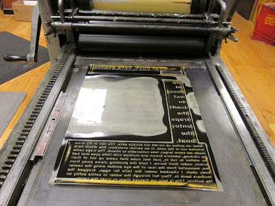


 A little bit into the runs the plates actually cracked. (The curling is a result of the plates slowly hardening and drying out, meaning that they are also becoming more brittle.)
 That reminded me of Robert Rauschenberg’s lithograph from 1963, Accident, where the stone broke during printing, but was used anyway and incorporated into the print.
 When I went back to printing What You Will about a month ago, I was concerned because even though I had stored the plates properly (flat, in plastic bags and in the dark) they had still curled quite a bit. And I had imagined them being as printed as dark, flat, perfectly geometric solids. I didn’t know what would happen. I was worried that the surface of the plates had warped and the type would be completely illegible. And I wondered, not so much worried, if the plates would crack. And I think that if they had, and assuming that the cracking would not have rendered the small type completely illegible, I would have went with it. Partly because I couldn’t afford to remake those plates for a third time, and also because the cracks would have added another layer of legibility. A nice, dark, as-planned solid lends a physicality to the print (especially in a book where the ink can be touched by the reader) but I think that they remain (at least somewhat) abstract. Whereas a cracked plate + print would be more concrete, more specific, more opaque, more legible, more present. The reader would be brought ever so slightly closer to the matrix and to the process.So maybe, maybe next time I will figure out how to really destroy those plates.
 I linked to this in a post last week, but it’s so fantastic that I’d thought I should mention it specifically: The William Blake Archive. It’s a comprehensive digital archive where you can view and read multiple copies of Blake’s illuminated/printed books. Things like this are one reason why the Internet and other digital technology is good for books, and good for those of us who are interested in them.Along with the works themselves there are also some informative essays about Blake’s life and about the process that he used to make the books. Here’s a brief passage (related to some other threads that have been running through this blog) from the essay about his process, “Illuminated Printing,” by Joseph Viscomi:
Blake realized very early that his new medium's autographic nature made the poem the only prerequisite for executing plates, that rewriting texts was also an act of visual invention, and thus that the medium could be used for production rather than reproduction. With no designs to transfer or reproduce, the placement and extent of text, letter size, line spacing, as well as placement and extent of illustration, were invented only during execution. This method of designing meant that Blake did not know what lines or stanza would go on what plate, or how many plates a poem/book would need. Working without models allowed each illuminated print and book to evolve through its production in ways impossible in conventional book-making. Blake could begin working on a book before it was completely written.
And of course you can also download Blake’s texts from Project Gutenberg.Several worlds to get lost in.
 This past Thursday (the seventh day of the seventh month) was the ILSSA (Impractical Labor in the Service of the Speculative Arts) Festival to Plead for Skills. Here is the description of the event from the ILSSA site:
This summer, on the 7th day of the 7th month, ILSSA will celebrate its own version of The Festival to Plead for Skills. The festival is derived from the Chinese holiday of Qi Xi and the Japanese festival of Tanabata, in which celebrants wish for the betterment of their own craftsmanship. Instead of wishing, the ILSSA festival will be a holiday of practicing.
We hereby invite all ILSSA Members to observe this holiday by making small objects as iterations of their practice. The objects should be no larger than 2 inches in any dimension, and should be the natural result of practicing a skill: using a tool, trying a method, honing a technique. Conceive of this project as something you can complete entirely on July 7th. We imagine Impractical Laborers across the land, practicing together in observance of the holiday.
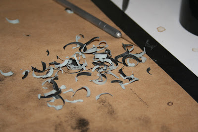
For this year’s festival (my first) I decided that I wanted to combine my practice with some hands-on research in type design. So I set up a series of 2” x 2” pieces of cover weight paper, each with a letter (laser)printed on it. I chose 5 different letters, in caps & lowercase, from three different typefaces (we were making 30 objects this year) that I wanted to study up close. The typefaces were: Palatino Linotype (my old favorite), Lucida Console (a weird san-serif face that I enjoy), and Matthew Carter’s Georgia (so that I could compare a serifed text face for the screen/web with one for print/book). After they were printed I delaminated each of them, carefully tracing their form. It was extremely satisfying to focus my attention on all the little details and to carry that attention through the actual cutting. This was probably some of the most accurate cutting I’ve done in a while. Something about focus, I suppose. This was a good and fun event, as it was personal and solitary (every participant chose what they wanted to do) as well as social (we all practiced together, and everybody gets one of each object). Every studio a networked node of production, independent and in concert.


 Printing on Kyle Schlesinger's What You Will has resumed, and has been going strong for the past two weeks. This post is sort of about that, but not really—It's about one of those weird, interesting things that can happen while one is working, those things that one needs to remember to use later. “Happy accidents” is what the kids like to call them. The pictures here show some strange, randomish printing on the tympan of the press. The “accidental matrix” here was a long piece of hair stuck between the quoin and furniture. It was long enough to pick up ink from the rollers and to brush against the tympan while I was printing. The line quality is really lovely, and of course the composition that is built up by the movement of the hair is something I never would or could have done if I had been trying to control it. This makes me wonder: what are the possibilities of a movable or flexible printing matrix, like pieces of hair, or string, or wire, or cloth, or something else?
 The first (and hopefully not the last) Indie Lit City Summit will be held in Washington DC on July 16. What is it? Here's (part of) the description from the website:
The Indie Lit City Summit is a regional gathering of editors, publishers, reading series coordinators, and other literary organizers to raise questions, surface issues, share information, and collaborate on solutions. There is an enormous amount of experience and expertise in our community that can be tapped into to better all our work.
I would definitely be going if I was still in the Baltimore/DC area. I would maybe even go now if I could afford it. The travel that is, because the event itself is FREE.And then there's the Independent Publishing Wiki, which I found through the City Lit Summit site. This kind of knowledge sharing & community building is wonderful.

I have been scouting around in the field of “book history,” and it is rich indeed. And of course the rest of the Internet: […] [L]iterary work by its very nature sets in motion many kinds of creative intentionalities. These orbit in the universe of the creative work—but not around some imaginary and absolute center. Rather, they turn through many different kinds of motion, at many structural scales, and in various formal relationships. The universe of poiesis no more has an absolute center than does the stellar universe we have revealed through our astronomy. What it has are many relative centers which are brought to our attention by our own acts of observation. The universe of literature is socially generated and does not exist in a steady state. Authors themselves do not have, as authors, singular identities; an author is a plural identity and more resembles what William James liked to call the human world at large, a multiverse.
Literary texts differ from informational texts by being polyvocal. Whereas “noise” is always a form of corruption for a channel of information, it can be exploited in literary texts for positive results. The thicker the description, so far as an artist is concerned, the better. (Minimalist styles of art thicken their media by processes of subtraction and absence.) A thickened text is a scene where metaphor and metonymy thrive (Coleridge’s “opposite or discordant qualities,” his “sameness with difference”). For [Hershel] Parker, the thickness comes from the artists’ imaginative resources, who can be counted on to put into their texts far more than they are even aware of. Parker’s “intention” includes, crucially, the vast resources of the unconscious and preconscious.
But thickness is also built through the textual presence and activities of many non-authorial agents. These agencies may be the artists’ contemporaries—these are the examples most often adduced—or they may not; furthermore, the agencies may hardly be imagined as “individuals” at all. The texts of Sappho, for example, gain much of their peculiar power from their fragmented condition […] [1]
[…] But what’s unique in the case of literature is that the text isn’t the finished work. A novel or short story isn’t a solid object. It’s just groundwork, and the reader’s imagination and reference points revive its content, extrapolate from its clues, and finish the work individually. In a way, when you’re writing a novel, for instance, you’re actually writing an unpredictable number of novels at once, and that number depends on how many copies end up being read. No other art form that I can think of involves that level of collaboration between artist and audience and disrupts the passiveness of being a work’s receiver with so much freedom and creativity. The high degree of interaction and codependence that the writer/reader axis makes possible is gorgeous and offers such a great opportunity to experiment with how text reacts when it comes in contact with the imagination. And writing allows you to play with the crapshoot decision of when a work is finished or, rather, when something is ready to be placed outside of your control and then finished by other people in largely unknowable ways. […] [2]
[…] But texts shape the response of readers, however active they may be. As Walter Ong has observed, the opening pages of The Canterbury Tales and A Farewell to Arms create a frame and cast the reader in a role, which he cannot avoid no matter what he thinks of pilgrimages and civil wars. In fact, typography as well as style and syntax determine the ways in which texts convey meanings. […] The history of reading will have to take account of the ways that texts constrain readers as well as the ways that readers take liberties with texts. The tension between those tendencies has existed wherever men confronted books, and it has produced some extraordinary results, as in Luther’s reading of the Psalms, Rousseau’s reading of Le Misanthrope, and Kierkegaard’s reading of the sacrifice of Isaac. […] [3]
[…] To this point I have been taking the word “text” to signify the linguistic text, the verbal outcome at every level (from the most elementary forms of single letters and punctuation marks up to the most complex rhetorical structures that comprise the particular linguistic event). And even if we agree, for practical purposes, to restrict the term “text” to this linguistic signification, we cannot fail to see that literary works typically secure their effects by other than purely linguistic means. Every literary work that descends to us operates through the deployment of a double helix of perceptual codes: the linguistic codes, on one hand, and the bibliographical codes on the other.
We recognize the latter simply by looking at a medieval literary manuscript—or at any of William Blake’s equivalent illuminated texts produced in (the teeth of) the age of mechanical reproduction. Or at Emily Dickinson’s manuscript books of poetry, or her letters. In each of these cases the physique of the “document” has been forced to play an aesthetic function, has been made part of the “literary work.” That is to say, in these kinds of literary works the distinction between physical medium and conceptual message breaks down completely. […] [4]
1. Jerome McGann, “The Socialization of Texts,” The Book History Reader, ed. David Finkelstein and Alistair McCleery (London: Routledge, 2002), 42.
2. From an interview with author Dennis Cooper that is part of the HTMLGiant “What is Experimental Literature” series of posts. You can read the whole interview (which is great) here.
3. Roger Darnton, “What is the History of Books?” The Book History Reader, ed. David Finkelstein and Alistair McCleery (London: Routledge, 2002), 21.
4. McGann, 43.
[First a quick note: This will be the last official post of “Manuscript Book Week,” but there will undoubtedly be more posts about manuscript books as research continues.] One interesting visual aspect of many of these manuscript books is the amount of spatial depth articulated on and in the pages, particularly on the pages that are heavily decorated/illuminated. The diagram below shows the relative depth of the different components of the spread pictured above, with the lightest shapes (white) showing the areas depicting the most depth, moving to black, where whatever is on the page seems to sit directly on or above the page surface.
 European manuscript books often mix “realistic” scenes that recede behind the picture plane, with abstract or trompe l'oeil decoration that stays on or above the picture plane. (For a quick comparison, scroll down to the post below and compare to the Qu’ran pages, with their more “modernist” use of geometric decoration.)The different colors of text and the actual surface of the page hover between those two poles, sometimes moving back and forth, depending on where the viewer/reader is looking. And of course the book itself is an object-in-space, on a table or in the reader’s hands, and participates actively in real space as well (as opposed to a painting, where the two-dimensionality seems fixed, because the painting is anchored to a wall).It would be interesting to use the kind of spatial manipulations demonstrated in manuscript books with photographic reproduction available now. If depicted three-dimensionality is actively used within a book, in concert with the (seemingly) two-dimensional pages moving in literal 3 & 4D space/time, plus the n-dimensional space of a properly tuned text, that could create a hyper-object that would tear a hole in the space/time continuum, as well as tear your face off and blow your mind up.
 “A 9th-century Qur’an, Near East, in horizontal format, written on parchment in kufic script, with red dots for vowels and green dots indicating the glottal stop. The large gold roundel marks the end of a tenth verse.” Or. 1397, ff. 18v-19. [1]Speaking of the conventionality of written/printed language: one experience that can make the nature and limits of that conventionality immediately clear and palpable is the experience of a second language, an-other-language, especially if that language is rendered in a completely different alphabet.While working on the Al-Mutanabbi broadside project I got to learn a small amount of Arabic and the basics of how the written language works. It’s interesting how the “idea” can be the same (a phonetic language) but the implementation can be completely different. Completely different but still able to be comprehended and used. An-other technology.
 “An 11th- or 12th- century Qur’an, from Iraq or Persia, written on paper in the Qarmatian style of eastern kufic script. The older system of red dots indicating vowels is combined with black vowel signs still in use today.” Or. 6573, ff. 210v-211. [2]The Arabic alphabet contains 29 letters, and each of those letters changes shape depending on where it falls in the word. Each character has a form for when it stands alone, when it begins a word, when it is in the middle of a word, and when it is at the end of a word. Like the “long s” that appears in old English, or the slight alterations that occur in English cursive letters to link them properly to the letter following them.
 “Detail from the colophon page of volume three of Sultan Baybars’ Qur’an, 1305-6, with the signature of the master illuminator, Abu Bakr Sandal, inscribed in the ornamental semi-circles (right).” Add. 22408, f. 154v. [3]The Arabic alphabet reads right-to-left. Apparently, this is a huge “problem” for design programs (like Adobe InDesign) but not so much for word processing programs, like Microsoft Word. Or maybe not a problem for the software but for the user who has to buy a second version of InDesign in order to properly set Arabic. But one can hack one’s way through the Arabic in the left-to-right version of InDesign using the “Glyphs” palette, much like setting metal type out of a case. An-other language.
 “A 17th-century Qur’an from Persia written in nashki script, with an interlinear Persian translation in red nasta’liq script.” Or. 13371, ff. 313v-314. [4][…] [T]he Arabic language […] belongs to the Semitic family of scripts which includes among other Hebrew, Aramaic, and Syriac. A common feature of all these languages is the fact that their alphabets are composed almost entirely of consonants, vowel signs being added only later to facilitate reading. […] [5]
 A detail of the previous image.It’s interesting to compare these manuscript Qur’ans to the European manuscript books, to see how they are similar and how they are different. How the rules of each culture (like the fact that illustration was forbidden in the Qur’an) helped to determine how the conventions of the written language developed. Paying attention to the conventions of various other languages can help us deconstruct our own, to pay attention to it, to dwell in it more fully, and to utilize it more incisively. 1. Colin F. Baker, Qur’an Manuscripts: Calligraphy, Illumination, Design, (London: The British Libray, 2007), 20-1. The numbers after each caption designate which manuscript and pages the images are from. All of the manuscripts are currently held at the British Library.2. Ibid., 24-5.3. Ibid., 46.4. Ibid., 78-9.5. Ibid., 13.


 Posts
Posts


