Showing posts with label The Heads. Show all posts
20140611
A JAB AT THE HEADS
The newest issue of JAB (The Journal of Artists’ Books), #35, has a short, thoughtful paragraph (& a color photo!) about The Heads of My Family, My Friends, My Colleagues, by Justin Sirois, in the “Books Received” section. The mini-review was written by Columbia College Chicago MFA student & Print Production Fellow Levi Sherman. This issue of JAB is pretty phenomenal—it is mostly artists’ books, six of them, to be exact.
Here is the full text on The Heads:
Justin Sirois has a knack for writing with, about, and for digital technology, so it is a pleasant surprise to see NewLights Press adapt his new book of poems The Heads of My Family, My Friends, My Colleagues to a letterpress printed codex that is perfectly suited to the content and style of the writing. On each page, black type is framed by dizzying, RGB-colored pixelesque patterns constructed out of en quads. Eight-bit tiles are knocked out of these borders, and like the poems themselves refer to online communication in their style, though the text itself also holds explicitly to the conventions of writing on the web and on cell phones. The book is as surprising as the poetry it contains, including blind embossed verses set on the interior spine fold—a thoughtful use of the double pamphlet structure. The book evokes a reading experience similar to browsing online—a schizophrenic, rhizomatic tour of sex, politics, pop culture, and everything in between, The writing, first-person and conversational, is engaging and holds the book together despite the breadth and obscurity of topics. This is a book that knows its audience and speaks powerfully both to and about them. (LS)
Thanks Levi! Thanks JAB!
Labels:
Community,
Friends,
Justin Sirois,
Plugs,
The Heads
20130624
THE HEADS OF MY FAMILY, MY FRIENDS, MY COLLEAGUES: poems by JUSTIN SIROIS
After just about two years of hard labor, we are so, so excited to announce that the new book of poems by long-time NewLights author Justin Sirois, The Heads of My Family, My Friends, My Colleagues, is out & available for purchase. Here is what some of our favorite writers have to say about The Heads:
Mike Young:
When you realize the new Old Spice ads might be working on you, when you're trying to split the difference between desk jobs and shoulder licks, when you're old enough for raunch to go holy but still young enough for GIFs to go infinite—that's when you know you're in the LoS of Justin Sirois's barking and bounding poems. The Heads are singing to the super ugly animals that pace the medians. They are twitching to put back some magic. They are winking that the word "okay" is the most useful word in the room, and they are hoping to be together with you because the only way a head gets a name is when another takes it in.
Dorothea Lasky:
The poems in The Heads by Justin Sirois make me feel so many things. They are not “temples,” but “squishy” things that “I love to put my face in.” I like it that way. These are poems that are part of life, constantly affirming and reaffirming it. A life that greets you with its magic. As when "What fits in the hand/ grows into armfuls." Or when you "sex this bathroom until the bathroom ain't for/ bathing no more." Everywhere is the “imagery” of life that “repeats in heaps of beauty." These are also poems that are part of the digital America we live in now and so they make that alternate existence beautiful. I hear echoes of Walt Whitman, Eileen Myles, and Blake Butler in these poems. I hear echoes of old folk songs. Most importantly, I hear the breathing of an indefatigable I in these lines. One that is living and listening. Let's follow it.
CA Conrad:
“The tattoo / underneath the tattoo / speaks the language I want to learn.” Justin Sirois has always been one of my favorite living poets. “You have / everything you need / when you’re naked”, I trust, I trust ALL his discourse with our throbbing excitement for communion. His poems are our best possible use for ears. If I don’t know you and you LOVE these poems as much as I do, let’s get together to read them out loud over a delicious slice of something. “Lick the window / & your reflection licks back” is a delicious something we all love. It’s important they know to have a copy of this book resting on my heart when they cremate me.
The Heads of My Family, My Friends, My Colleagues
Poems by Justin Sirois
84 pages, double signature pamphlet stitch with folded jacket
8” x 6.25” (closed)
Laser printing, letterpress from lead type, lead spacing material and linoleum
Variable edition of 150 (three different jacket/cover/endsheet color combinations)
2013
$20 (plus shipping)
Please note that we will not be able to accommodate individual requests for colors. The books will be shipped as orders are received—red, green, blue….
Labels:
Announcements,
Catalog,
Justin Sirois,
The Heads
20121108
PRODUCTION IS RECEPTION (50): THE HEADS (9)
It is hard to be aware of how little one pays attention to something. Big things are moving in Art & Life these days, and the mornings, usually reserved for writing blog posts, have been filled with the meditative work of cutting and peeling paper. So there’s that. But today some time to write a bit about the nighttime activities—the continued adventures in the printing of The Heads (of My Family, My Friends, My Colleagues) by Justin Sirois.
In earlier blog posts and on the NewLights Facebook page, there are some cryptic photos and descriptions of the “pixel grid” of The Heads. So I thought I’d explain a bit about what that actually is, how it works. These images are a bit old now—production has advanced to some later stages/colors. But more on that soon.
In the designs of other NewLights books where I was printing from photopolymer plates I tried to make that decision to use the plates count—to use the plates to print a book that only could have been made with them. For The Heads I wanted to try something different: to use a combination of good ol’ laser printing with letterpress, and to see where that led the book. This helps keep material costs down (those plates & films are expensive) and is appropriate for the content of the poems, which talk about life and images on, off and between our screens.
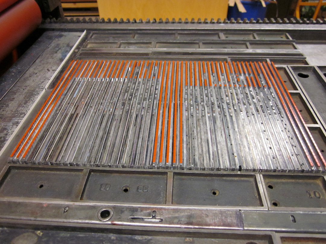
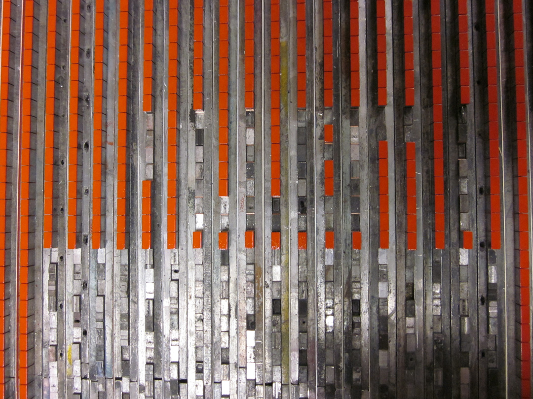
So the pixel grid. It is made from lead type, specifically from spacing material for lead type. With the assistance of the nice people at the M & H Type Foundry I was able to get 10 lbs. of 12 pt. en quads in “high spaces”—spaces that are a bit higher than regular word spaces. (I believe that these spaces would normally be used to support the kern of letters at the end of a word, say the “f” in “of,” but I’m actually not sure about that.) So with the high spaces I can still use regular spaces as spaces, and regular leading to hold the lines. And that negative space is important—it is what makes the grid do its work.
So the columns of the gird are assembled in lines, with copper spaces between each piece vertically, and 6 pt. slugs and paper leading (equal to 1 pt. in thickness) between them. The gaps in the columns will form the letters of the poem titles (the titles are all all-cap “acronyms” like TFIEG), made from the modular alphabet described in earlier posts. The grid itself, when complete, will contain groups of three columns in different colors—made to emulate the RGB grid of the screen. So the spacing matrix is assembled to print all of the red columns on a single page spread, and then it can be broken apart/reconfigured to print all of the green columns by just moving it 6.5 pts over in the press bed. And then the blue after that. I am doing all of a single color first, so there is a great deal of reconfiguring before the press runs containing titles. The lines of spacing are extremely prone to falling over at the ends, so it has taken me some time to get into the haptic rhythms of working with them effectively. But now things are moving. The text, the grids, the book, accumulate.
Labels:
Justin Sirois,
Production is Reception,
The Heads
20120910
PRODUCTION IS RECEPTION (49): THE HEADS (8)
Nothing like a weekend of technical failure to reinvigorate the spirit. This weekend was reserved to begin printing the “pixel grids” on the pages of The Heads (of my family, my friends, my colleagues), the forthcoming book of poems by Mr. Justin Sirois.
Those grids are being printed from lead matrices constructed from spacing material—“high spaces”—in this case 12 pt. En quads. This first set-up was supposed to be the “matrix-matrix,” the modular set-up that would yield all the others.
I eagerly set it up on Saturday, anxious to see if it would actually work, knowing that I would probably have to adjust it, but hoping beyond hope that I wouldn’t. It printed:
But as I had guessed, there won’t be enough white space between the individual “pixels” in a column. In the above image you can kind of see them, but once they are printed with more impression & ink, those tiny cracks will fill up. So I thought, Okay, no big deal, I’ll just add some paper spaces between all of the lead pieces.
& besides I had forgot to reverse the matrix for printing, so it was all going to have to come out anyway.
Little did I realize that all of my schemes for producing roughly 3,500 6 pt. paper spaces would also fail. After messing around with the guillotine for a bit, I decided that I could set up the lines in InDesign, print ‘em out & cut them by hand. But that didn’t work either:
So it looks like I’ll be ordering a bunch of 6 pt. coppers.
Luckily, there are other pieces of the book that I can work on while I’m waiting on those. So I don’t have to waste any more time.
& speaking of wasting time—one thing we like to say around here is that “learning is making mistakes.” I sure am doing a lot of learning on this one….
Labels:
Justin Sirois,
Production is Reception,
The Heads
20120530
20120523
PRODUCTION IS RECEPTION (47): THE HEADS (6)
Fig. 05.12.09
A detail from the initial series of type sketches (see previous Production is Reception post), showing some beginning display letters, potentially for use on the title page of The Heads.
Oh, it’s so much fun not to have any idea what I’m doing. Well, sometimes it’s fun, other times it’s nerve-frying and soul-twisting. But that’s part of the fun too. So here we are with another post of me bumbling through “lettering design.”
Fig. 05.12.10
First of new series of drawings specifically for the title type. The regular alphabet letters at the top show a brief flirtation with the idea of lowering the crossbar on the “A.”
These letters began with a slightly taller version of the regular alphabet (see Fig. 05.12.09), but as I recreated these digitally and enlarged them, I realized that they should be drawn at actual scale (using the same base grid) as that would allow for more variation in the design (like having a stem with a width of 3 blocks instead of a multiple of 2).
Fig. 05.12.12
The final? Perhaps….
I’m still sorting out, still thinking through, what this kind of activity means for the larger process of making books (for NewLights—so the large but local sense), of making books strange. & of course this is just the design stage—setting these things in lead, manipulating and printing them, is going to be another matter entirely. But the activity in & around & through these letters is energizing and informing the whole process in a new way for me. Which is always the point when figuring out any new book.
A detail from the initial series of type sketches (see previous Production is Reception post), showing some beginning display letters, potentially for use on the title page of The Heads.
Oh, it’s so much fun not to have any idea what I’m doing. Well, sometimes it’s fun, other times it’s nerve-frying and soul-twisting. But that’s part of the fun too. So here we are with another post of me bumbling through “lettering design.”
Fig. 05.12.10
First of new series of drawings specifically for the title type. The regular alphabet letters at the top show a brief flirtation with the idea of lowering the crossbar on the “A.”
These letters began with a slightly taller version of the regular alphabet (see Fig. 05.12.09), but as I recreated these digitally and enlarged them, I realized that they should be drawn at actual scale (using the same base grid) as that would allow for more variation in the design (like having a stem with a width of 3 blocks instead of a multiple of 2).
Fig. 05.12.11
Figuring out the shapes and trying out decorative elements—the “serifs” or “beaks” on the “T” and “E.”
So more drawings, then. No need to bore you with the details. I’m still not totally happy with these, but we’ll see where it goes. And of course the position on the page, along with any other text (the rest of the title, author name, press name, etc.), will play a huge role in how they look at the end.
Figuring out the shapes and trying out decorative elements—the “serifs” or “beaks” on the “T” and “E.”
So more drawings, then. No need to bore you with the details. I’m still not totally happy with these, but we’ll see where it goes. And of course the position on the page, along with any other text (the rest of the title, author name, press name, etc.), will play a huge role in how they look at the end.
Fig. 05.12.12
The final? Perhaps….
I’m still sorting out, still thinking through, what this kind of activity means for the larger process of making books (for NewLights—so the large but local sense), of making books strange. & of course this is just the design stage—setting these things in lead, manipulating and printing them, is going to be another matter entirely. But the activity in & around & through these letters is energizing and informing the whole process in a new way for me. Which is always the point when figuring out any new book.
Labels:
Justin Sirois,
Production is Reception,
The Heads
20120518
PRODUCTION IS RECEPTION (46): THE HEADS (5)
& The Heads will contain my first (somewhat) legitimate foray into type design. As you may have deduced from earlier “digital sketches” that were posted here (here & here), the design of the book is tied to the idea of RGB color, in particular to the RGB phosphors that allow our precious & pernicious & delicate screens to show color.
Fig. 05.12.01
First sketches. The grid was set up on the computer and printed out so that I could work by hand. 12 pt. en quads, a 1:2 grid.
So, a grid, then, in red, green & blue. And type for the titles composed of, built out of, that grid. Letterpress printed from spacing material, flat rectangles of lead, ordinarily the physical component that makes a blank space on the printed page, now arranged in a pixel grid, raised up, inked and printed. The trace of the non-space, the brilliant color of the mutable absence.
Fig. 05.12.02
Working with variations on the letterforms.
The design of a modular typeface is a pretty basic typography exercise. But since I don’t know much about type design it seemed like a good place to start. (Thinking with Type by Ellen Lupton and Lettering & Type by Bruce Willen and Nolen Strals, have been my guides.) & it has certainly been instructive. Even within a rigid system there are many variations of a letterform that can be created (see Fig. 05.12.02).
Fig. 05.12.03
The top alphabet contains some lowercase forms. The bottom is closer to the final designs, with each letter being made up of an odd number of “pixels”—1, 3 or 5. Except for the ampersand, formed from an “E” and “t,” and four “pixels” wide.
The titles for the poems are in all caps, so the designs are only for those letters (& the ampersand), done at actual size. These initial drawings were done by hand. I think that when they’re actually printed, they will rest somewhere between the unevenness of the drawn versions and the cleanliness of the digital renderings (see Fig. 05.12.08).
Fig. 05.12.05
The final alphabet at the top, and renderings of the actual titles.
But there is always the title page(s) and cover as well. So maybe there will be a more decorative version (see Fig. 05.12.04). Bigger though.
Fig. 05.12.06
More renderings of the actual titles. Playing with word spacing and the “TT” and “TTT” ligatures.
Putting the letters into use in the actual configurations of the titles yielded new problems. The form of the “Y” was determined by how it looked in a specific title (YSYSYS, see Fig. 05.12.04), as that title was the most heavily patterned. Problems of spacing also became apparent, particularly with the “T,” so I decided to use ligatures when there was more than one “T” in a row (see Fig. 05.12.06).
Fig. 05.12.07
More titles. Some redrawn with the ligatures. The letterspacing is still not perfect on the grid, but the ligatures work better.
These letters, honestly, are the put of the book that I am most unsure about at this point. Partly the design of the letters themselves, partly the technical aspects of actually printing them, and partly how they will drive the overall design and feel and experience of the book. Too much? Too weird? Too bright? Too big?
Fig. 05.12.08
The clean, digital alphabet with some title tests. The printed versions will not be this clear and consistent.
But these are the risks that come along with a challenge.
Fig. 05.12.01
First sketches. The grid was set up on the computer and printed out so that I could work by hand. 12 pt. en quads, a 1:2 grid.
So, a grid, then, in red, green & blue. And type for the titles composed of, built out of, that grid. Letterpress printed from spacing material, flat rectangles of lead, ordinarily the physical component that makes a blank space on the printed page, now arranged in a pixel grid, raised up, inked and printed. The trace of the non-space, the brilliant color of the mutable absence.
Fig. 05.12.02
Working with variations on the letterforms.
The design of a modular typeface is a pretty basic typography exercise. But since I don’t know much about type design it seemed like a good place to start. (Thinking with Type by Ellen Lupton and Lettering & Type by Bruce Willen and Nolen Strals, have been my guides.) & it has certainly been instructive. Even within a rigid system there are many variations of a letterform that can be created (see Fig. 05.12.02).
Fig. 05.12.03
The top alphabet contains some lowercase forms. The bottom is closer to the final designs, with each letter being made up of an odd number of “pixels”—1, 3 or 5. Except for the ampersand, formed from an “E” and “t,” and four “pixels” wide.
The titles for the poems are in all caps, so the designs are only for those letters (& the ampersand), done at actual size. These initial drawings were done by hand. I think that when they’re actually printed, they will rest somewhere between the unevenness of the drawn versions and the cleanliness of the digital renderings (see Fig. 05.12.08).
Fig. 05.12.04
Drawings for the potential “decorative” letters for the title pages. Some tests of kerning the letters, and variations of the “Y” in context.
I liked some of the earlier versions with a “modulated” stroke, but after conducting a few tests with the actual titles I determined that the best option would be a “condensed” typeface. And then it was a matter of refining the system and looking for workable, related shapes for the letters. I experimented with lowercase forms for some of the more problematic letters (B, D, R, K), but eventually settled on only using the lowercase form for the “N,” while the “Q” is both capital and lowercase (see Fig. 05.12.03).
Drawings for the potential “decorative” letters for the title pages. Some tests of kerning the letters, and variations of the “Y” in context.
I liked some of the earlier versions with a “modulated” stroke, but after conducting a few tests with the actual titles I determined that the best option would be a “condensed” typeface. And then it was a matter of refining the system and looking for workable, related shapes for the letters. I experimented with lowercase forms for some of the more problematic letters (B, D, R, K), but eventually settled on only using the lowercase form for the “N,” while the “Q” is both capital and lowercase (see Fig. 05.12.03).
Fig. 05.12.05
The final alphabet at the top, and renderings of the actual titles.
But there is always the title page(s) and cover as well. So maybe there will be a more decorative version (see Fig. 05.12.04). Bigger though.
Fig. 05.12.06
More renderings of the actual titles. Playing with word spacing and the “TT” and “TTT” ligatures.
Putting the letters into use in the actual configurations of the titles yielded new problems. The form of the “Y” was determined by how it looked in a specific title (YSYSYS, see Fig. 05.12.04), as that title was the most heavily patterned. Problems of spacing also became apparent, particularly with the “T,” so I decided to use ligatures when there was more than one “T” in a row (see Fig. 05.12.06).
Fig. 05.12.07
More titles. Some redrawn with the ligatures. The letterspacing is still not perfect on the grid, but the ligatures work better.
These letters, honestly, are the put of the book that I am most unsure about at this point. Partly the design of the letters themselves, partly the technical aspects of actually printing them, and partly how they will drive the overall design and feel and experience of the book. Too much? Too weird? Too bright? Too big?
Fig. 05.12.08
The clean, digital alphabet with some title tests. The printed versions will not be this clear and consistent.
But these are the risks that come along with a challenge.
Labels:
Justin Sirois,
Production is Reception,
Sketches,
The Heads
20120516
PRODUCTION IS RECEPTION (45): THE HEADS (4)
& that’s when things started to get strange (any Thing that is strang).
I always wonder about how much I want to detail in these process posts, about how much of the book I want to show before it’s done. But here we go again, anyway, what else can we do?
One of the primary concerns whenever a NewLights book is being developed is how to make the book GO—how to reach into the text (whatever that “text” may be maybe) and pull out its strangeness and translate that to the physical-temporal book object itself.
This process often terrifies me, because it runs the real risk of real failure.
But hopefully that means that I’m on something. Still, the doubt is always there, twisting in my stomach. What follows is an example, the first nervous part of The Heads.
All of the poems have bizarre titles, in all caps, like:
IMATAYM
ATTWD
WAPAUSHTGOWYLD
NSIILTOBIGOTB
I am very intrigued by these titles. I don’t know what they “mean.” But I do know that I want to draw attention to them, and that they could or should be a major design element of the book.
“Design element?” Maybe that doesn’t go far enough. I struggle with the word “design” in this context. It’s too removed, too after-the-fact. Too much about “presenting” the text. What we want is to produce the text(-book-object), enact it. Not to make a crystal goblet, but to distill the complex, intoxicating drink itself.
A writing alongside the writing. A writing underneath the writing. This process often terrifies me. The book twists in my stomach.
Labels:
Justin Sirois,
Production is Reception,
Sketches,
The Heads
20120515
PRODUCTION IS RECEPTION (44): THE HEADS (3)
It is not so much a case of determining the success (or in this case FAILURE) of the experiment—it is a matter of bringing to light problems not seen in the original hypothesis.
Labels:
Justin Sirois,
Production is Reception,
Sketches,
The Heads
20120509
PRODUCTION IS RECEPTION (43): THE HEADS (2)
THE HEADS
*
OF MY FAMILY:
*
OF MY FAMILY:
OF MY FRIENDS:
For Rodchenko/For Travis/For J (again):
Working Notes Toward The Heads #FFFFFF
NewLights Press: Justin Sirois & A. Cohick
3 digital books, 64 pages each, 8” x 12” (open)
Pure RGB colors
Edition determined as viewed
2012
Free
20120423
PRODUCTION IS RECEPTION (42): THE HEADS (1)
I sat down here today (it’s early here today)
& said, “I’m going to write something
powerful!” & then I said, “That’s the
worst fucking idea I’ve ever had.”
The lines above are the first stanza of HTAYKSSS, a poem by Justin Sirois, that will be in his new book, the next new NewLights book, The Heads. Yesterday as I retyped those lines they made me think of my own early morning writing, the writing that often ends up on this blog.
And so we begin to collect the brilliant pieces of the last month, a month engaged in intense discussion and thought about the thing, the usual thing, the every-thing, the making of books. We will see if we can make this last month into a “turning point.” I have a feeling now that those can only occur retrospectively. The most important thing is the follow through.
Work has begun, in a real way, on The Heads. I spent the weekend retyping the poems. Retyping wasn’t necessary in terms of efficiency—I was retyping them from the printout of the text doc that is already on my computer. Retyping is a way to really, almost literally, spend some time in the poems.
Retyping is an activity that grows out of my experience of setting texts in lead type. It allows me to get to know the texts in a way different from the (often too ephemeral) experience of reading, even of close reading. One has to look at how the poems are built—how is capitalization handled? Just how much space is there between these lines? Just how far should those indents go? Etc.
Editing and designing a book tend to be more “big picture” activities. Retyping the poems is a way of getting to know the forest by looking very carefully at the individual trees.
Retyping also turns the poems sharply towards me, as I prepare to reproduce, to multiply, them. The first imprinting of the book occurs in my consciousness. The trick now is to make that individual experience and imprinting many, multiple, public, shared, accessible, wondrous, etc.
Going carefully through the poems again this weekend also made me remember how much I believe in them, how excited I am to have the chance to help make them a part of the world. They were made strange. I couldn’t believe them.
& so it begins again &
Labels:
Justin Sirois,
Production is Reception,
The Heads
20110921
FOR RODCHENKO
For Rodchenko/For Travis:
Working Notes Toward The Heads
NewLights Press: A. Cohick, et al
3 digital books, 96 pages each, 9” x 12” (open)
Pure RGB colors
Edition determined as viewed
2011
Free
Labels:
Digital Editions,
Other,
Pre-Texts,
Sketches,
The Heads
Subscribe to:
Posts (Atom)