skip to main |
skip to sidebar
The other big question that emerged during the construction of the second iteration of The New Manifesto of the NewLights Press (other than the minor details of text-content, the overall design, and the titling type) was how to handle the visual elements. I wouldn’t really call them images. The non-text text, perhaps. The writing-design of the book was a kind of palimpsest of the first iteration—using the same size, shape, and the same basic visual/formal structure, the idea being that this second iteration would exist as a kind of layer over the first iteration. Not an obliteration, but more of a pentimento. The book should always show its scars.


The first iteration used rotated and flipped pieces of Jan van Eyck’s The Arnolfini Portrait as images. Thinking through how and why those images were used, how they function in the first iteration, I decided that a new “image” seemed appropriate, but one that would bring different complications into the construction. I settled on appropriating & distorting pieces of Frank Stella’s black painting, The Marriage of Reason and Squalor II, (1959). The reasons for this choice were multiple & shifting, and I don’t want to go into a specific, limiting description here. But the painting’s title is one of my all-time favorites, and in & of itself fits nicely with the NewLights Press aesthetic.
Frank Stella, The Marriage of Reason and Squalor II, enamel on canvas, 1959
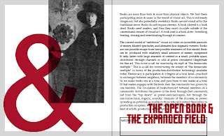
The digital mock-up of the pages with the Stella images looked like this:
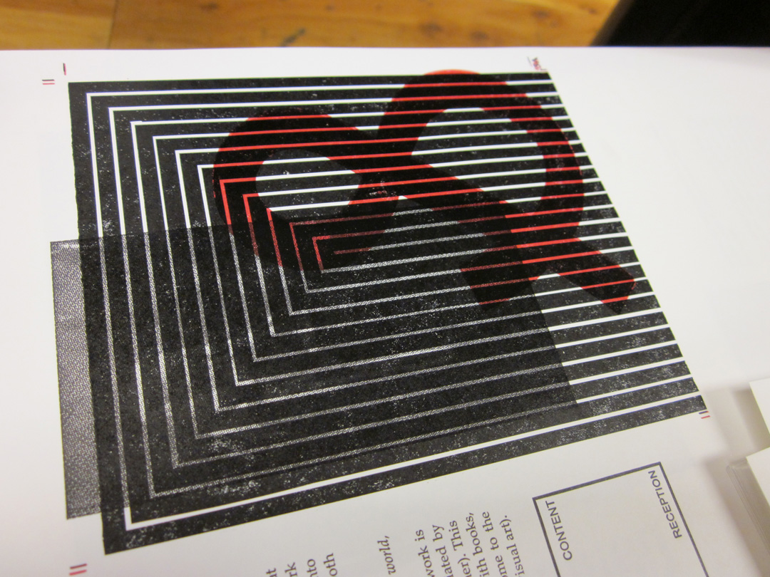
But always the questions: how to print them, should that printing be related to the van Eyck images of the first iteration, and if so, how? My initial idea was to print the Stella images straight from photopolymer, but to cut the films with rubylith by hand, without a straight edge, in order to make the edges less rigid as in the original painting. But that didn’t seem to be enough—simply relying on the title of the paintings and the reader’s knowledge to make the connection would be too tenuous & wouldn’t actualize the layering of the text/books. I decided that both images should be printed, the original van Eycks and the new Stella, right over top of the other. The van Eycks would be printed as halftone photographs directly from the photopolymer:


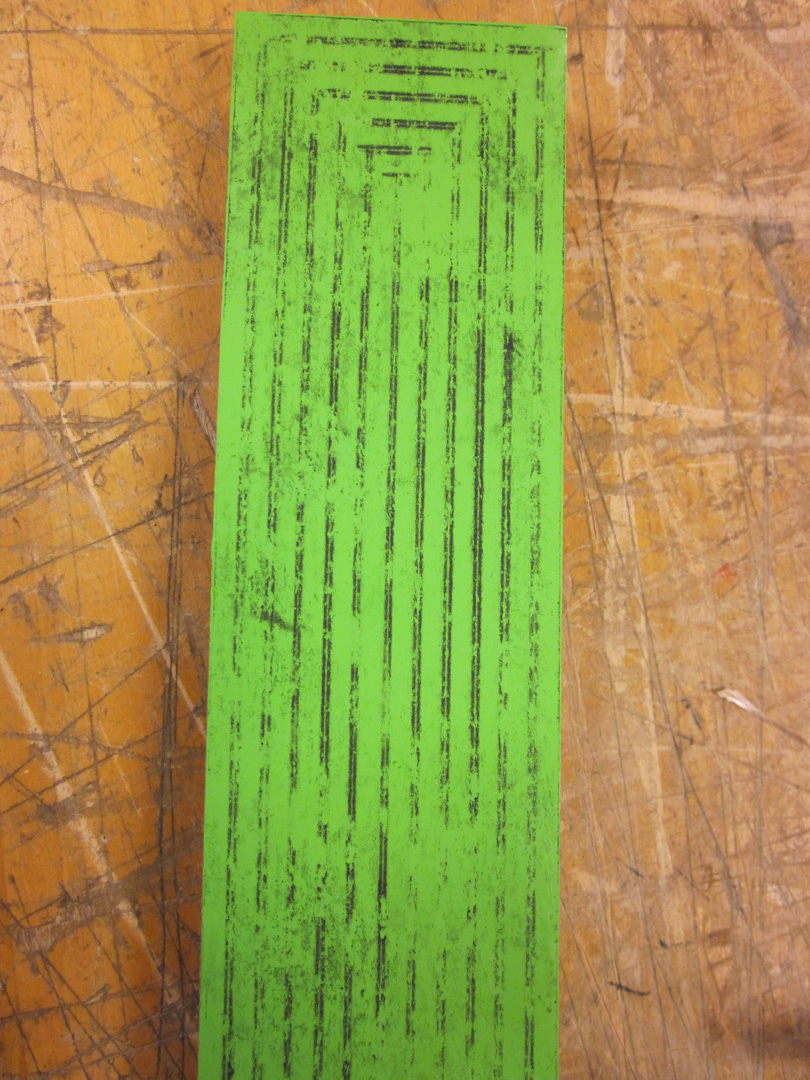
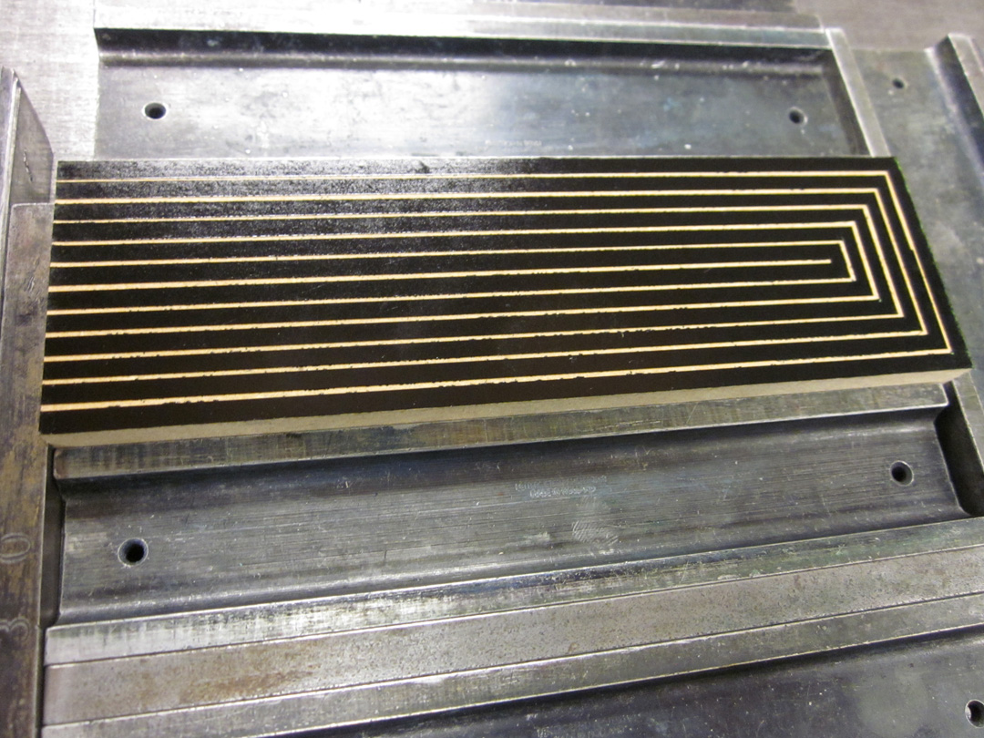
And the Stella images would be printed from hand-cut, vinyl collagraph blocks, which would give the stripes the edges that I wanted, but would also print with a different surface quality and thus bring the physical material of the printed pages more to the reader’s attention. Obviously, printing the images from collagraphs would mean more labor: making the blocks, and then printing them in separate runs/lock-ups. My hope was that the transformation of the printed surface, and the legibility/attention to the material that would bring, would make it worthwhile. But isn’t that always the hope with these things. Here are some images from the construction of the collagraph blocks:
Most of the printing of the collagraphs went very smoothly, as expected from earlier tests. The cover block did not behave as planned—it fell apart while printing—but that was actually better & more on that in the next post.
The layering (printed in two slightly different blacks, one rubber-based, one oil-based) was subtle but effective. The images, with their heavy, messy, physical black are enjoyable to touch and look at closely. They are difficult to read, but still very legible.
Also, the second iteration of The New Manifesto of the NewLights Press will be officially released on this coming Monday, April 22, 2013.
It was so much fun to make the modular titling type for The Heads that I wanted to do it again for the second iteration of the New Manifesto. In the first iteration I used the face Placard Condensed for the titles, which has been a longtime favorite of mine, even before I realized that it is essentially, at least in the capital letters, supposed to look like the lovely, generic, “Gothic” wood type that is common in letterpress studios. The thing that I don’t like about that typeface is that it often looks too condensed for my purposes. This is a major typographic confession—I’ve often used it and widened the glyphs 20% – 30%. As far as I know no one has ever noticed, but after I started looking carefully this time around, it became awkwardly obvious. So it was time for some new titling type.


Why modular type? The main answer, for me, is constraint & how that drives formal & structural decisions. I am drawn to the aesthetics of modular type, and it fits nicely with the formal qualities & structure of books—books (often) have rectangular pages, and they are at their core modular constructions—page after page after page designed on grid over grid over grid.
The complication (or perhaps luxury) that I gave myself this time around was the inclusion of a second modular unit—a triangle that is one half of the base square. I knew that I was going to print these letters from photopolymer plates, so why not, you know, get crazy?
I played with shapes & contours of the individual letters themselves for a while, trying out different shapes and refining. I needed numbers for this book, and that complicated things a bit, as the shapes of “S,” “Z,” “2” and “5” are very similar once curves & angles are eliminated. I could have used the same shape several times and relied on context to make the glyph, but I wasn’t sure that context would be enough in the case of the titles.
As the shapes of the letters developed I realized that there was something else to consider—proportion. While I was trying for letters that weren’t as narrow as Placard Condensed, I still needed them to be somewhat condensed so that they would fill the marginal space of the page. The width of the individual glyphs is one thing, but how narrow they are depends on the relationship of width to height. (This is all basic stuff, I know, but I am a beginner when it comes to type design, and these small realizations are an important part of learning.)


After I settled on the proper proportions for the letters, I was able to refine the contours within those proportions and determine the final letterforms. One challenge with modular type (at least in how I’m approaching it at this point) is its monotony & rigidity. It often looks forced into the flexible space of the book, particularly when paired with a great text type—like Palatino Linotype, which is what I was using for the main text of the book. The last tweak I made to the modular face was to change its base unit from a square to a vertically-oriented rectangle that was half of that square. The original square was still used for most of the letters, but that rectangle allowed for some small subtle differences that gave the letters more character and made some of them appear less awkward. The “F” and “G” are two examples.


Using the rectangle of the base unit also gave me more flexibility when typesetting and spacing the letters, allowing me to stay within the modular system when spacing but giving me enough options to balance the spaces out better.
The above images show the actual setting of the titles. I did not make these letters into an actual, usable font—I just drew them as vector objects within InDesign and cut & pasted them into place. Once they were set I could just copy them into the actual book document and scale them appropriately. Even during typesetting I still played with the letterforms a bit—it’s just so hard to resist the impulse to keep refining the letters. But there was a deadline & I had to get to printing. So here are some images of the type printed from the photopolymer plates:
The second iteration of The New Manifesto of the NewLights Press is essentially complete (though I need to reprint exactly half of the covers and then finish binding, due to a, shall we say, minor incident), but won’t be released for Internet sales until Monday, April 22. Right now most of the edition is acting as an installation-ish piece in a show here at the Coburn Gallery in CO Springs. So this next series of posts, detailing the production of the book, are not as in-the-moment as the “Production is Reception” posts often are. But here we go.
The Second Iteration has been percolating, marinating, for quite a while. For more than a year, perhaps two. It was never quite a real thing until I decided for sure that it was going to be a (major) part of the latest show. For most of its existence it has been a bunch of notes, some pieces of sketchy text, and some vague design ideas, like this:


The idea was always to make this new iteration a revision-ing or rewriting of the first book, similar in structure, design, themes, etc. But not simply an “updated” version of the same text, same book. I didn’t know exactly what all of this meant until I really got in the thick of the writing-design. In fact, the specificity of the relationship between the two iterations did not fully emerge until I was just about ready to start printing. The books, when they’re working, funnel themselves towards a precipice. They crystallize at the edge, silent in their poised, posed, paused ideal. Time restarts & they fall, not in a beautiful, freefall dive, but in a clumsy tumble, banging against the side of the cliff all the way down.
Such drama, such wounds to be sustained. To be continued.
Work on the second iteration of The New Manifesto… continues, and the NewLights mission statement continues to be tweaked. Here’s the latest:
The NewLights Press is an independent printer & publisher of experimental writing and artists’ books, concentrating on where the two can and do overlap. All of the books are printed & bound “by hand,” using a variety of techniques, ranging from the obsolete (letterpress) to the utilitarian (laser printing) to the meditative (delamination). We try to maintain inclusive (& purposefully problematic) definitions of such mutable terms as “experimental writing,” “artists’ books,” and “printing techniques,” and to be similarly inclusive in the kinds of books that we produce, in an attempt to allow the different kinds of production to merge, separate, and converse with one another. We believe in the actual use value of art objects as soft, temporary spaces in and against which individuals & communities can envision & articulate their relationship to, and shape in, the world. We are not searching for the Ideal Book—we are looking hard at & reading closely from the book-in-the-world. We represent only one of the many geographical/historical meeting points of a vital and diverse community of active, thoughtful people, and our work would mean nothing without that community. The production of books is our own, weird way of saying to the world: we believe in you. & you & you & you & you & you & you & you & you & you & you […]
The folks at the Vista Sans Wood Type Project (see post below for more on this) have started a new, improved Kickstarter campaign to fund their book project. Now when you donate you can choose exactly which print you want. Which is awesome, because these things are fucking sweet. No really, I just saw them all at Codex. Get on this.
Hatch Show Print’s motto is: “Preservation Through Use.” When they say this they are talking specifically about their collection of historic type & image blocks. They “preserve” those physical things by continuing to use them and keeping the iconic images that they produced circulating in the culture. The idea of “preservation through use” is an oxymoron—using those blocks is not going to preserve them. That use is going to destroy them.
Generally speaking, when it comes to Book Arts & letterpress printing, I am against preservation. Not that I want to see all of our lovely tools, equipment & materials burned & scrapped. Quite the opposite, actually. I am against preservation in the sense that something that needs to be “preserved” is something that has died, that is in the process of rapid decay. The preservation impulse in Book Arts, while noble & in some ways worthwhile, is holding it back.
Letterpress printing, hand bookbinding, small/private press publishing, etc., etc. are commercially obsolete. That does not mean they are “dead”—historically over, sealed shut, capable of no further development in aesthetics and/or technology. The Economy is not the only economy. These things—these techniques, tools, equipment, processes, materials, ways of doing-learning-moving—are living things. & there is, terrifyingly, excitingly, more work to be done.
The Vista Sans Wood Type Project gets at several very important things:
1) It literally advances the technology of type production & letterpress printing. There is now a typeface that was never available as type, in lead or wood, in the world in physical form. And the type is different from traditional wood type—some of it has a very visible grain. It is not so precious anymore—it can be kerned, mortised, cut, spliced without worry. It points toward even more possibilities.
2) The project is not just about the type, it’s also about its utility & function. The functional/shareable is the new relational.
3) The project is not just about the type, it’s also about how it’s used to advance the aesthetic range of letterpress printing. You can see lots of the prints in the video above. Very few of them look like a “traditional” letterpress broadside. & that points to one very, very important thing about letterpress printing—it’s an extremely flexible & adaptable medium. The pinnacle of its aesthetic achievement was not/is not black, serifed text type on white or off-white paper.
4) The project is not just about the type, it’s about community, about this community of incredible people making incredible things.
Things like the Vista Sans Wood Type Project are absolutely crucial to keeping the fields of book arts, printing, typography, design, publishing, etc., etc. moving & interesting & fun. Tricia & Ashley have already made the type, but now they need some funds to make a book documenting the project—a book that will take the project even further. Please consider helping them out by following the link at the end of the video or by clicking here.


Because the new New Manifesto is being written:
The NewLights Press is an independent printer & publisher of experimental writing and artists’ books, concentrating on where the two can and do overlap. All of the books are printed & bound “by hand,” using a variety of techniques, ranging from the obsolete (letterpress) to the utilitarian (laser printing). We try to maintain inclusive (& purposefully problematic) definitions of such mutable terms as “experimental writing,” “artists’ books,” and “printing techniques,” and to be similarly inclusive in the kinds of books that we produce, in an attempt to allow the different kinds of production to merge, separate, and converse with one another. We believe in the actual use value of art objects as soft, temporary spaces in and against which individuals & communities can envision & articulate their relationship to, and shape in, the world. We are not searching for the Ideal Book—we are looking hard at, & reading deeply of, the Book-in-the-World. We represent only one of the many geographical/historical meeting points of a vital and diverse community of active, thoughtful people, and our work would mean nothing without that community. The production of books is our own way of telling the rest of the world that we believe in them.
It is hard to be aware of how little one pays attention to something. Big things are moving in Art & Life these days, and the mornings, usually reserved for writing blog posts, have been filled with the meditative work of cutting and peeling paper. So there’s that. But today some time to write a bit about the nighttime activities—the continued adventures in the printing of The Heads (of My Family, My Friends, My Colleagues) by Justin Sirois.

In earlier blog posts and on the NewLights Facebook page, there are some cryptic photos and descriptions of the “pixel grid” of The Heads. So I thought I’d explain a bit about what that actually is, how it works. These images are a bit old now—production has advanced to some later stages/colors. But more on that soon.
In the designs of other NewLights books where I was printing from photopolymer plates I tried to make that decision to use the plates count—to use the plates to print a book that only could have been made with them. For The Heads I wanted to try something different: to use a combination of good ol’ laser printing with letterpress, and to see where that led the book. This helps keep material costs down (those plates & films are expensive) and is appropriate for the content of the poems, which talk about life and images on, off and between our screens.
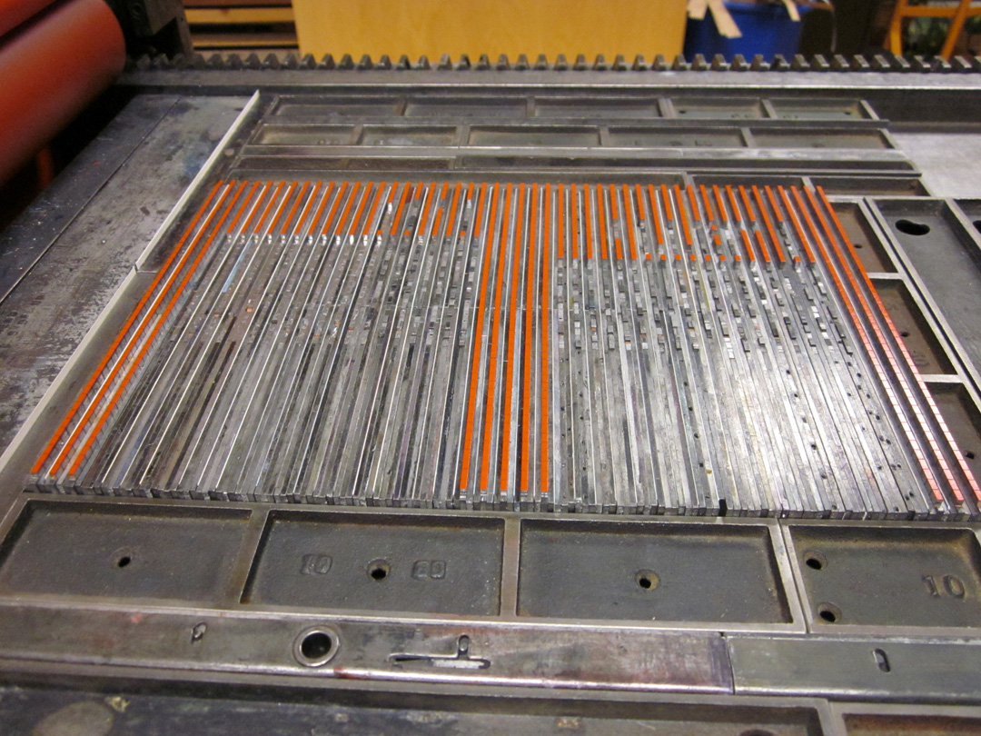
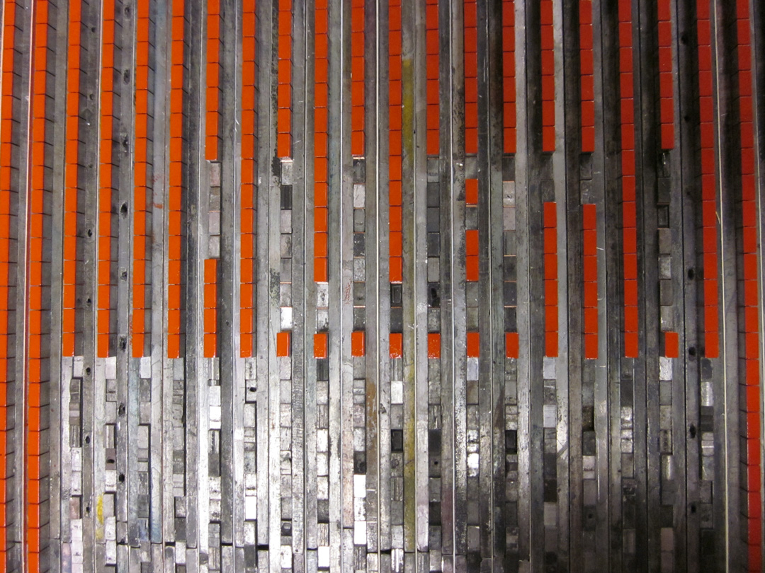
So the pixel grid. It is made from lead type, specifically from spacing material for lead type. With the assistance of the nice people at the M & H Type Foundry I was able to get 10 lbs. of 12 pt. en quads in “high spaces”—spaces that are a bit higher than regular word spaces. (I believe that these spaces would normally be used to support the kern of letters at the end of a word, say the “f” in “of,” but I’m actually not sure about that.) So with the high spaces I can still use regular spaces as spaces, and regular leading to hold the lines. And that negative space is important—it is what makes the grid do its work.


So the columns of the gird are assembled in lines, with copper spaces between each piece vertically, and 6 pt. slugs and paper leading (equal to 1 pt. in thickness) between them. The gaps in the columns will form the letters of the poem titles (the titles are all all-cap “acronyms” like TFIEG), made from the modular alphabet described in earlier posts. The grid itself, when complete, will contain groups of three columns in different colors—made to emulate the RGB grid of the screen. So the spacing matrix is assembled to print all of the red columns on a single page spread, and then it can be broken apart/reconfigured to print all of the green columns by just moving it 6.5 pts over in the press bed. And then the blue after that. I am doing all of a single color first, so there is a great deal of reconfiguring before the press runs containing titles. The lines of spacing are extremely prone to falling over at the ends, so it has taken me some time to get into the haptic rhythms of working with them effectively. But now things are moving. The text, the grids, the book, accumulate.


It was the first reading in a new series called “Say Hello to Your Last Poem.” The readers were Matt Potter, a promising & motivated Colorado College student, and Corina Copp, a fantastic poet from Brooklyn & author of Pro Magenta/Be Met (Ugly Duckling Presse, 2011). The series is being organized by Noel Black (author of Uselysses, also Ugly Duckling Presse, 2011) and myself, and it was held at the home of Noel and his wife, artist/curator Marina Eckler. They have this incredible house with a backyard that extends up to a red rock outcropping, like a mini national park, and that’s where we did the actual reading, with crazy colored lights and the vastness of the sky & mountains behind the readers. It started with a potluck dinner and just the right amount of people came out. Everything synced.
So why am I making such a big deal out of a little house reading? It’s not a novel format, even here in the Springs, which has a thriving house-show-music scene. And one would expect a good reading from two good poets. Hey, no big deal.
& “no big deal” is absolutely correct, which is why it was awesome, and which is why I am excited about it & the future of doing this. Because these things don’t have to be a big deal, and they’re often better if they’re not. All one needs is an interested & loving & awesome local community. & we’ve got that here in Colorado Springs, believe it or not.
The people, the place, the work, the event itself. It’s all there, shimmering, and on top of all that I realized what’s been missing from the work of the NewLights Press for far, far too long—being anchored in a community, one that is both local & reaching out & welcoming in. (It’s been since the early days in Baltimore, when we were organizing readings, making chapbooks, and having a great & terrible time all of the time.) I’ve often said, on this blog and elsewhere, that one of the most important & vital parts of small press publishing is the community, the community already established, and the community that the making & sharing of work is constantly building. But in all of my transience over the last 8 years (!) I had forgotten that literally bringing people together is one of the best parts, one of the most important parts.
I had somehow forgotten about the interplay between the work produced (the writing, the books) and the local-right-there-and-giving-you-hugs audience, about how important those flesh & blood & laughing people are, and about how work made in that environment can become an anchor point for a shared, lived experience.
More readings? Yes.
More books? Yes.
We hope to see you all here soon.
Nothing like a weekend of technical failure to reinvigorate the spirit. This weekend was reserved to begin printing the “pixel grids” on the pages of The Heads (of my family, my friends, my colleagues), the forthcoming book of poems by Mr. Justin Sirois.
Those grids are being printed from lead matrices constructed from spacing material—“high spaces”—in this case 12 pt. En quads. This first set-up was supposed to be the “matrix-matrix,” the modular set-up that would yield all the others.
I eagerly set it up on Saturday, anxious to see if it would actually work, knowing that I would probably have to adjust it, but hoping beyond hope that I wouldn’t. It printed:
But as I had guessed, there won’t be enough white space between the individual “pixels” in a column. In the above image you can kind of see them, but once they are printed with more impression & ink, those tiny cracks will fill up. So I thought, Okay, no big deal, I’ll just add some paper spaces between all of the lead pieces.
& besides I had forgot to reverse the matrix for printing, so it was all going to have to come out anyway.
Little did I realize that all of my schemes for producing roughly 3,500 6 pt. paper spaces would also fail. After messing around with the guillotine for a bit, I decided that I could set up the lines in InDesign, print ‘em out & cut them by hand. But that didn’t work either:


So it looks like I’ll be ordering a bunch of 6 pt. coppers.
Luckily, there are other pieces of the book that I can work on while I’m waiting on those. So I don’t have to waste any more time.
& speaking of wasting time—one thing we like to say around here is that “learning is making mistakes.” I sure am doing a lot of learning on this one….










 Posts
Posts


